
Happy National Scrapbook Day!
Extra 10% OFF Select Scrapbooking Brands with Code: NSD24
Extra 10% OFF Select Scrapbooking Brands with Code: NSD24

 Give a Cheer
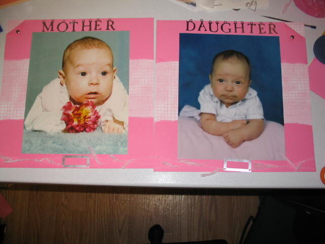
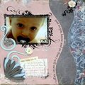
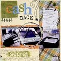
This is a page I am doing. This is what I need advice on. Should I have it say Like Mother Like Daughter. or should I have it say what it says now Mother and Daughter. Also should I just use the metal accent on the M and the D or for the whole word...I would use black vellum letters for the rest of the word...a little explination. the part at the bottom of the page is where I am going to put the month and year of each picture and I am not going to leave the eyelet holes on the letters, I am going to cut them off.
Let me know what you think,
thanks
No products have been added to this project.
Thanks for spreading positivity!


October 04, 2003
October 04, 2003
October 04, 2003
October 04, 2003
October 04, 2003