SCHG: Nice work. You do such interesting hybrid techniques. I think the title and journaling are kind of hard to read, however. I'd also like to see a smaller border around the photo as it takes away from their faces.
SHCG - I love the sunny & warm colors you use here, Marsha, they set such a joyous, loving mood! The background pp is very pretty, as are the different fonts & the floral "happiness" stamp embellie. The ruffle looks fantastic! Now, I think the "Janna & Aunt Billie" writing kind of competes w/ the title, I think that to remedy that you could either matte the "My Auntie & Me" part as Christy suggested, or move the "Janna & Aunt Billie" part to under the photo (keeping the font style but making it way smaller & tucking it in the lower left corner). I LOVE that you challenged yourself to go hybrid on this & combined the digi you love w/ the paper ruffle. Wonderful work!!
SHCG: I really like the combo of the digi and the paper. The background pp is beautiful. If i were to suggest something i would suggest you matte the "My Auntie & Me" with a brown also. Otherwise, nice job.
SHCG: Love the matting for that picture. I think that your title and journaling are way too stark in comparison to the softness of the remainder of the LO, especially the silver of the title. I'd love to see you use more earthy/neutral/natural tones for that writing and possibly distress them in some fashion to make them "fit" a bit better.
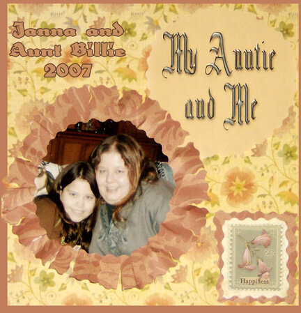
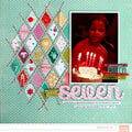
this is a brenda walton k and company paper and stamp. the lo is for the schg paper frill challenge. they got me out of my box and made me do a hybrid!!the paper, frill, stamp and mat are paper the rest is digital.
Does this project or one of it's images contain pornography, profanity, or other illegal or offensive material? If so, please report it and our moderators will come by and clean it up in a flash.
August 31, 2008
August 20, 2008
August 19, 2008
August 17, 2008
August 10, 2008
August 10, 2008
August 10, 2008
August 10, 2008
August 10, 2008