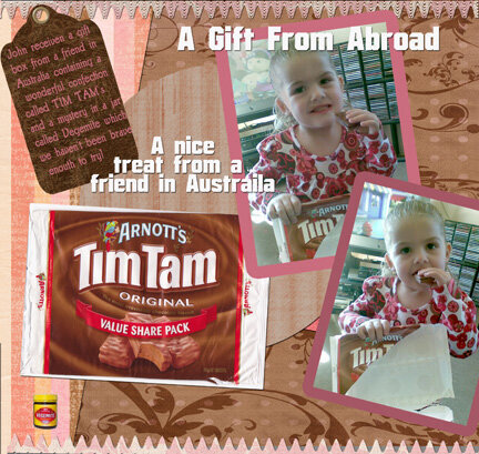
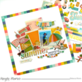
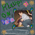
shch: super page LUV the pattern paper with the swirls, your photos and the pennant borders. My only suggestion might be to move the little bottle in the lower left corner to that blank spot just above "a nice"
SHCG: What an adorable DGD you have! The photos are perfect and I agree with brenda, they could be used for a commercial! I feel a lot of Chris' suggestions on this layout. It is such a fun layout!
Beautiful page, love the top and bottom borders. I just received some Tim Tams from a friend from this site. They are really good. I traded some Oreos.
SHCG: What a neat idea to do this LO :) You DGD is so cute, love that you took pics of her enjoying her treat! I do like the ruffles on the top and bottom. My only suggestion would be to have the pictures be more of the focus instead of the pic of the treat!
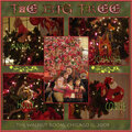
SHCG: Sweet idea to send this to your Aussie friend. I like the lace borders at the top and bottom, and all the layering. Her DGD is adorable! These pics might as well be for a Tim Tams commercial. I'm really feeling Chris's critiques on this one, except I'd like to see a ribbon through that eyelet on the tag. I think the title would look nice in a light pink with a white shadow effect. Again, keep in mind, you have two "titles" that are competing with each other because they are the same size, font, and color. On the far left you have a pink striped patterned strip that has a wide margin at the top and thin at the bottom. I'd like to see this in one consistent width or changed to a semicircle. Spell check enough and Australia. I'm sure your friend will be touched by your token of gratitude.
SHCG: Such a neat idea to send this to her! I don't know how I feel about the ruffly borders at the top and bottom of the page though... I think you could do without.
SHCG - This is a terrific page! Great way to show your appreciation of the gift by scrapping these pics, love how you show her DGD enjoying these products & incorporate the labels too. Lovely colors & patters, perfect & pretty. I am kind of wishing that the journaling on the tag was a little lighter for easier reading, like a beige or a light pink. I would also move that text over so it doesn't cut so close on the right side of the tag. Also, I hope that this scan just cut off the right side here, as I wouldn't want that bottom pic being cut off like that. Not sure how I feel about the tiny Vegamite jar where it is...maybe overlap it on the bottom edge of the Tim Tam's label, like between the middle bottom edge & the bottom right corner at an angle? Kind of floats unanchored where it is now. I do agree w/ Chris on the brad in the tag & the pink to the left of the bottom pic, (though I prolly wouldn't have notice those otherwise). A fun & pretty LO, I love what you've got going on overall here!
SHCG: Love the colors and papers you're using. Cute pictures. My recommendations: Bring the tag down slightly and put a brad through it. It seems unfinished without one. There's a small piece of pink to thr right of the circle and bottom picture -- get rid of it. It doesn't look like it goes anywhere so it's out of place. I'd also mute down the title a bit - it's too much of a contrast that bright white, and I'd probably try not to overlay the writing directly ove the picture (title's cutting through the head, etc.). There's a nice empty spot to the bottom where that title would fit wonderfully. :)
Does this project or one of it's images contain pornography, profanity, or other illegal or offensive material? If so, please report it and our moderators will come by and clean it up in a flash.

 Give a Cheer


September 17, 2008
August 31, 2008
August 25, 2008
August 25, 2008
August 22, 2008
August 21, 2008
August 19, 2008
August 17, 2008
August 17, 2008
August 16, 2008
August 16, 2008
August 16, 2008