SHCG: What a fun page LUV the bright colors. My only suggestion would be to add their names to the white space to the left of the word fun or add a twister spinner arrow.
SHCG: Fantastic! I love the use of the primary colors to replicate the circles on the twister mat. I am getting a backache just remembering the twister game. :-) I love how all of this comes together. You may not have liked the materials separately, but they look great together!
SHCG: What a fun LO!!! I just love how you did the LO to look like a twister mat ~ so cool. I also like the title and the alphas! The photo corners also adds a nice touch. Great job :)
SHCG: I think this LO is totally fun! Even though you hate primary colors you made great use of them and were able to tie them into the subject of the photo perfectly. Great job.
schg: when i was scrolling down the page and these dots came in to view i immediatly thought of twister, even before i saw the whole thing.this is cute and immaginative. maybe you could add a small written comment in the space next to "fun" .
SHCG - How fun is this?! Groovy how you recreated a Twister mat for this outta those bright circles, I would've never guessed this was for a fugly paper challenge. Awesome pic & title font! The "2007" file tab is cool too. I agree w/ Brenda, would love to have "peeking into Ashlynn's room" somewhere, even on the back, just to preserve the way you caught these playful stolen moments. Overall, excellent job!
SHCG: ITKWYM about primary colors, but this is such a fun page. I love the title font, and the chippie. The tab and photo corner are nice touches. I know you explained that the picture speaks for itself, but I actually think it could a short caption like, "Housebound on a rainy day," or "Game Night at Aunt Sally's," written directly under the photo mat, starting from the bottom left corner. It will fill up a little of that white space. I love the jubilant look on your dd's face. She brightens the page.
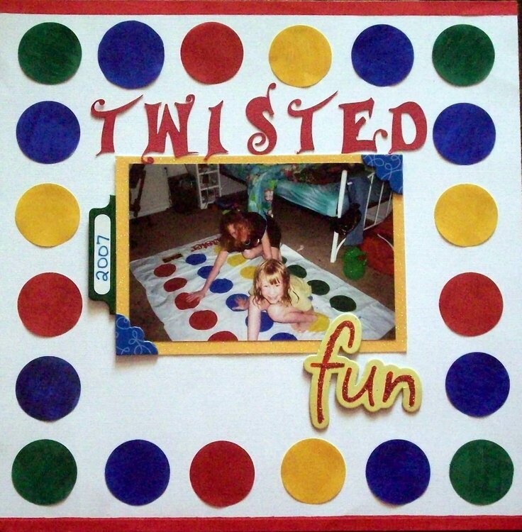
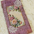
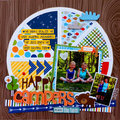
This is for the fugly pp and embelie challange. I cut out the circles and put pop dots behind them (they were on a white back ground anyway) and I also cut the edging off the pp so it looks like the original pp with out the center dots. I didn't particularly like the embelies either, but I think they came together fairly well. The pic is of my DDs having fun playing twister. The LO is straight, just the pic is messed up. TFL!!
Does this project or one of it's images contain pornography, profanity, or other illegal or offensive material? If so, please report it and our moderators will come by and clean it up in a flash.
September 18, 2008
September 17, 2008
August 31, 2008
August 27, 2008
August 27, 2008
August 26, 2008
August 26, 2008
August 26, 2008
August 26, 2008
August 25, 2008
August 25, 2008
August 25, 2008
August 25, 2008
August 25, 2008
August 24, 2008
August 24, 2008
August 24, 2008
August 23, 2008
August 22, 2008
August 22, 2008
August 22, 2008
August 22, 2008
August 22, 2008
August 22, 2008
August 22, 2008
August 21, 2008
August 21, 2008
August 21, 2008
August 21, 2008
August 21, 2008
August 21, 2008