Thank YOU! It's Customer Appreciation Week!
EXTRA 11% OFF Orders $100+ With Code: THANKYOU
EXTRA 11% OFF Orders $100+ With Code: THANKYOU

 Give a Cheer
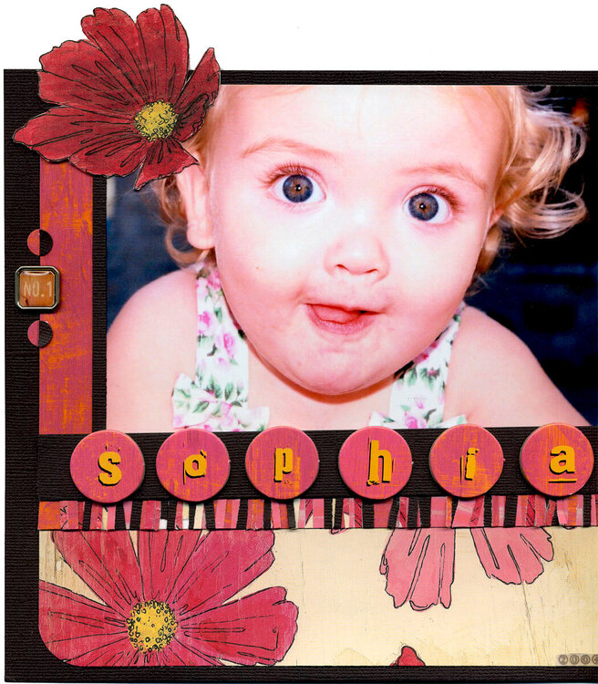
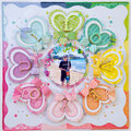
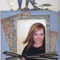
Sophia is One
by Vicki Stegall
Image is clickable to view larger for detail.
Please see index cards detail.jpg for journaling on index cards in the mini file folder.
Products used:
Rusty Pickle:
Patterned Papers:
Pats Cosmos
Orange Crush
Beach House Pink
Orange Crush Alphabet
Aloha White Rub-Ons
Mini File Folder: Beach House Blue
Other:
Cardstock: Bazzill Raisin
Basic Grey Square Dome Brads: No. 1
All Night Media: Mini Pop Dots
Unknown: paperclips, striped ribbon
Vellum (for the date and My Family)
Techniques:
Pink Circles on edges:
I punched 2 sizes of circles from the Orange Crush paper and 1 small circle from brown
cardstock cut in half.
Fringe:
I cut tiny, tiny strips of Pats Cosmos, Orange Crush, and Beach House Pink papers and the brown cardstock and randomly stuck them to a piece of double sided tape stuck on a scrap of photo paper. Then, I trimmed them and covered it with a strip of the brown cardstock.
The number 1:
I cut out the 1 from brown cardstock then matted it with the Orange Crush, punched little circles from the Pats Cosmos, Orange Crush, and Beach House Pink papers and tied the ribbon.
Mini File Folder:
Since the package of file folders came with three, I decided I could embellish one on this LO to match like I had done on the Roadtrip page. I embellished it with Rusty Pickles Beach House Pink cut into 1 lengths and wove them together.
For the brown and pink stripes on the my favs label, I cut tiny strips of the Beach House Pink and brown cardstock, laid them side by side and taped. MY FAVS letters are Rusty Pickles Aloha White Rub-Ons.
For the border on the inside, I wove together the Beach House Pink and brown cardstock. Then I punched little circles from the Pats Cosmos, Orange Crush, and Beach House Pink papers and applied randomly on the brown cardstock.
I had to use two layers of mini pop dots under the pocket so the mini file folder would slide in more easily.
Index Cards:
Designed as tables in Word and printed on photo paper. They are all the same size IRL but they scanned a little wonky.
Thanks for looking!
No products have been added to this project.
Thanks for spreading positivity!


October 31, 2005
October 31, 2005
October 31, 2005
October 30, 2005
October 30, 2005
October 29, 2005
October 29, 2005
October 29, 2005
October 28, 2005
October 28, 2005