FREE Standard Shipping on Orders $69+ with code:
FREESHIPPING


Cheers
Give a Cheer

 Give a Cheer
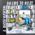
When I found out I was going to be odd this month, I knew I would be doing something special for the 11th. I spent all day photographing what I felt evoked patriotic emotions in me. Once I settled on this photo, I knew I needed to edit it. I used Gimp to give the image a more nostalgic feel with the Sepia tone. I really wanted it to feel as though I was reminiscing over the past 7 years. I then pulled the colors through of just the flag. I felt that the flag really symbolized our nation. It wasn't blowing brilliantly in the wind. It was hanging there. Saying we've been through a lot, but we're still here. In this version, I saturated the colors to make the red and blue really stand out. I wanted them to scream We may be hurt, but we're still here! I don't know if this detracts from the more nostalgic feel, however. That is why I also included an unsaturated version which I like just as much. I'd love to hear which you all prefer. Thanks :o)
No products have been added to this project.


Thanks for spreading positivity!
%20-%20Scrapbook.com)


September 19, 2008
September 19, 2008
September 15, 2008
September 14, 2008
September 13, 2008
September 13, 2008
September 13, 2008
September 12, 2008
September 12, 2008
September 12, 2008
September 12, 2008
September 12, 2008
September 12, 2008
September 12, 2008
September 12, 2008
September 12, 2008
September 12, 2008