Thank YOU! It's Customer Appreciation Week!
EXTRA 11% OFF Orders $100+ With Code: THANKYOU
EXTRA 11% OFF Orders $100+ With Code: THANKYOU


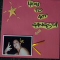
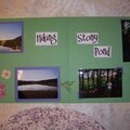
 Give a Cheer
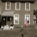
When I found out I was going to be odd this month, I knew I would be doing something special for the 11th. I spent all day photographing what I felt evoked patriotic emotions in me. Once I settled on this photo, I knew I needed to edit it. I used Gimp to give the image a more nostalgic feel with the Sepia tone. I really wanted it to feel as though I was reminiscing over the past 7 years. I then pulled the colors through of just the flag. I felt that the flag really symbolized our nation. It wasn't blowing brilliantly in the wind. It was hanging there. Saying we've been through a lot, but we're still here. In this version, I did not saturate the colors of the flag. I left them more faded (as they were in real life) showing the pain and suffering that we have endured. This version, to me, seems more solemn, while the other is more about strength. I'd really appreciate it if you could view them both and give me your opinion. Thanks :o)
No products have been added to this project.


Thanks for spreading positivity!

%20-%20Scrapbook.com)


September 15, 2008
September 15, 2008
September 14, 2008
September 13, 2008
September 12, 2008
September 12, 2008
September 12, 2008
September 12, 2008
September 12, 2008
September 12, 2008
September 12, 2008