

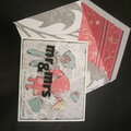
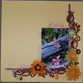
Cheers
Give a Cheer

 Give a Cheer
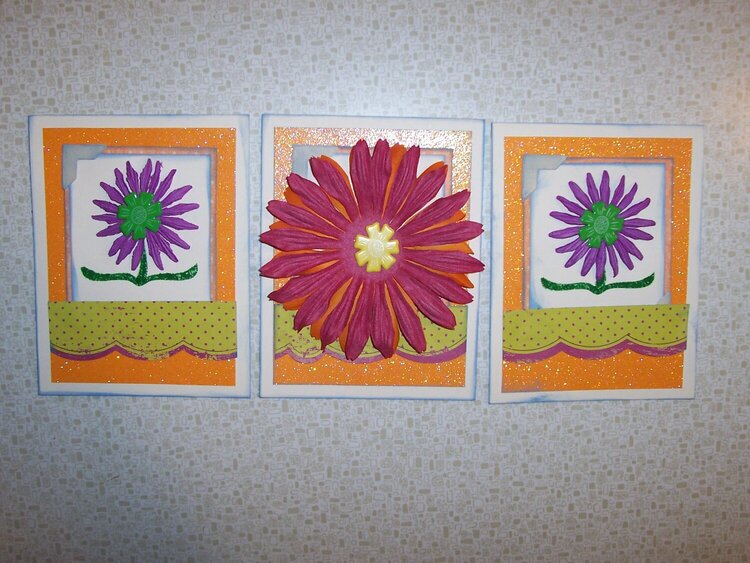
Created these cards for my Guest spot in Scrappy Jo's Scrapbook Supplies Creative Team.
From my GCTM supplies:
1 Doodlebug Sugar Coated Cardstock - Tangerine
1 Making memories Delaney DieCut Scallop
Making Memories Double-sided Delaney Ledger Circle (Note Worthy)
Petaloo Double Delight flowers Orange/Burgundy
Queen & Co Large Flower Brads - Primary
From stash: Random flowers, acrylic bracket stamp (Studio G, I think), Ink It Up! french blue pigment ink, green dye ink

Thanks for spreading positivity!


January 02, 2009
December 08, 2008
October 15, 2008
October 05, 2008
October 04, 2008
October 03, 2008
September 24, 2008
September 24, 2008
September 22, 2008
September 22, 2008
September 20, 2008
September 20, 2008
September 19, 2008