SHCG: Marsha, I love the mirroring effect that you used for the card. Perfect here. I would like to see some cards fanned out underneath the card to create a little bit of depth. I love the eclectic font that you used for the title. It really is whimsical!
SHCG: I love what you did with the card! So cool. I also love the variety of fonts and colors, they all work together in a Vegas-y way. :) I'd like to see a mat or 2 underneath the card though. Great job!
SHCG: What a great response to the challenge, love the pic of your dgc and the mirrored effect, all the different fonts are neat, I do agree with Janet, I'd like to see a border around the whole page also :)
SHCG: Fun idea. Fun page. I like all the different fonts for the name, and I love the playful font of the title. I'd like to see the title straightened out, though. Also, I think this page needs some layering. Right now each section is a separate entity--photo, names, title. I think a stack of cards underneath the Jokers card would be a quick remedy that keeps with the theme.
SHCG - Excellent concept on this! I love the playing card w/ your amazing DGC, love the bright colors & cool varying fonts! I could see another one of those "transparent" type swirls (like the one on the right) along the bottom, to add some interest to that space while not making it in a color that would detract from the focal points of the LO. Fabulous BWC response, Marsha!
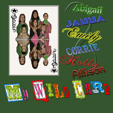
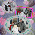
sorry, i copped out. the bwc was for a trump card, but i think you can use jokers as a wild card and use then for trumps! also i am fanatic about my dgc. so here is the bwc!
Does this project or one of it's images contain pornography, profanity, or other illegal or offensive material? If so, please report it and our moderators will come by and clean it up in a flash.
January 03, 2009
November 11, 2008
October 20, 2008
October 16, 2008
October 07, 2008
October 07, 2008
October 05, 2008
October 05, 2008
October 04, 2008
October 04, 2008
October 03, 2008