SHCG: Great idea with the photo coming in from the right. The striped paper adds a great punch to the LO and, of course, you have to put the Iowa logo in there. Great page, Jesse!!
SHCG: I'm actually impressed that this came out of being po'd at the bf! I can't scraft when I'm feeling this way with my man. I love the simplicity both in the color scheme and overall composition. Great titlework, and incorporating the journaling with it. I love the hole punched scallop edge, and your super cute toes. Good thing the school has a cool logo for its mascot, because it makes for a pretty cool tattoo. My only suggestion is to add a white strip with University of Iowa Hawkeyes written on it, secured with the flower's brad, over the top of the yellow, and oriented to the left. Fantastically fanatic of you!
shcg i love this!(dh is a tatoo artist) i love tatoos. and i love your TOES. (sorry that just slipped in there) anyway this lo is light and cute and a wonderful responce to the challenge.
SHCG - This rocks! I love the photo, the tat & how the pp/colors/flower coordinate so well together. Placement is awesome - the scalloped/hole punched solid paper a great emphasizing background for the title, nice placement of the the mascot strip, the sporty stripes w/ the pic & coordinating flower - not a thing I'd change about those! Overall design is utterly groovy. Okay now I'm curious, this is "one" of your University of Iowa tats?? You gotta show us the rest! Now, I know this is probably ingrained in you but for future viewers who have no idea about the mascot/colors, I wouldn't mind seeing "University of Iowa" somewhere, like on a tiny journaling strip. Or on the back. But just would like to memorialize it somehow. Outstanding challenge response, Jesse!!
SHCG: What a great LO and cool tattoo! I'm guessing those are the team colors, love that color combo, great how you added the image down the middle of the page, and the flower is so pretty :)
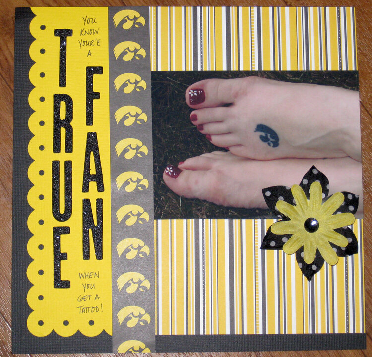
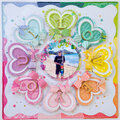
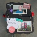
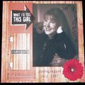
For SHCG BWC #20- create a LO about something you are fanatical about, including photographic evidence. This is one of my University of Iowa themed tattoos. :) And I just now noticed that I wrote "your'e" instead of "you're". What an idiot. Never scrap late at night when you're p***ed off at your boyfriend.
Does this project or one of it's images contain pornography, profanity, or other illegal or offensive material? If so, please report it and our moderators will come by and clean it up in a flash.
August 28, 2009
August 24, 2009
January 03, 2009
November 27, 2008
November 11, 2008
October 19, 2008
October 14, 2008
October 10, 2008
October 09, 2008
October 08, 2008
October 07, 2008
October 07, 2008
October 07, 2008
October 07, 2008
October 06, 2008
October 06, 2008
October 06, 2008