I agree with Karen. It was hard for me to figure out the quote because I though Knowlede was supposed to fit in the middle, but it's not actually part of the quote. Am I making sense? The vellum idea is terrific for this. The black pulls in his shirt but is there any way to pull a color from the photo to use on the knowledge text?
I'm hesitant to give any feedback other than all wonderful, because it looks GREAT! But I'm hoping by wanting feedback you really do want constructive criticism? The quote is GREAT, but I feel the black and white lines are competing with each other. I think they need to be more different. If it were me (which it's not, please feel free to ignore), I might try making the word "Knowledge" in a tall vertical sans serif font (such as Helvetica Condensed) in a size that would fill the whole space available and make the word "Knowledge" maybe in white vellum so it blends into the background a little more but is still clearly readable.
IMHO, this lo is outstanding!! I saw it on the homepage, and I just had to comment and tell you how much I like it. I love the classic feel this lo has and how the stripes on the side seem to mimic the books in the photo. Speaking of the photo, its fantastic! You could not have found a better background for it, and I love how the lighting gives him a soft glow. And who better to quote about knowledge than Shakespeare? Great job!!!
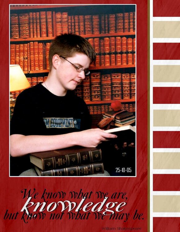
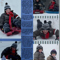
This is a recent photo of my 15 year old. I am not sure about this page, and would appreciate any feedback. backgrounds are Jump into fall by Daniella Peuss of scrapartist.com
Does this project or one of it's images contain pornography, profanity, or other illegal or offensive material? If so, please report it and our moderators will come by and clean it up in a flash.
November 20, 2005
November 17, 2005
November 16, 2005
November 16, 2005
November 16, 2005
November 16, 2005