


FREE Standard Shipping on Orders $69+ with code:
FREESHIPPING

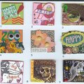
 Give a Cheer
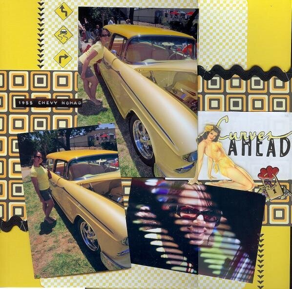
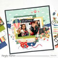
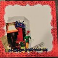
This is for the SHCG BWC #21-Go Monochromatic! The pictures of the '55 Chevy Nomad are from an annual local classic car show that we enjoyed this summer. There is no additional journaling because this will be a page in a series for an album I plan to make for this event.
Thanks to Marlene (scrappygal8), I may go monochromatic for the whole album.
Also, thanks to Sharon (blushpea) for helping me to see yellow and old pp in a different light. She used the black/yellow squares pp in response to the same challenge. The checkered pp and road signs are from a very old stash!
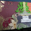
Shout out to the SHista who gave me the Marah Johnson epoxy sticker. The pin-up girl is art from the web. To achieve a shadow effect, I put her on pop dots, and I layered two flower rain dot stickers to the printed flowers in her hair. These effects and the silver gel pen highlights on the title letters show up better irl. Sorry for the bad scan and stitch job.


Thanks for spreading positivity!


January 10, 2010
January 10, 2010
January 10, 2010
January 10, 2010
September 05, 2009
September 05, 2009
April 28, 2009
March 01, 2009
February 18, 2009
December 31, 2008
November 27, 2008
November 25, 2008
November 11, 2008
November 11, 2008
November 08, 2008
November 07, 2008
October 30, 2008
October 30, 2008
October 28, 2008
October 27, 2008
October 27, 2008
October 27, 2008