FREE Standard Shipping on Orders $69+ with code:
FREESHIPPING

Cheers
Give a Cheer

 Give a Cheer
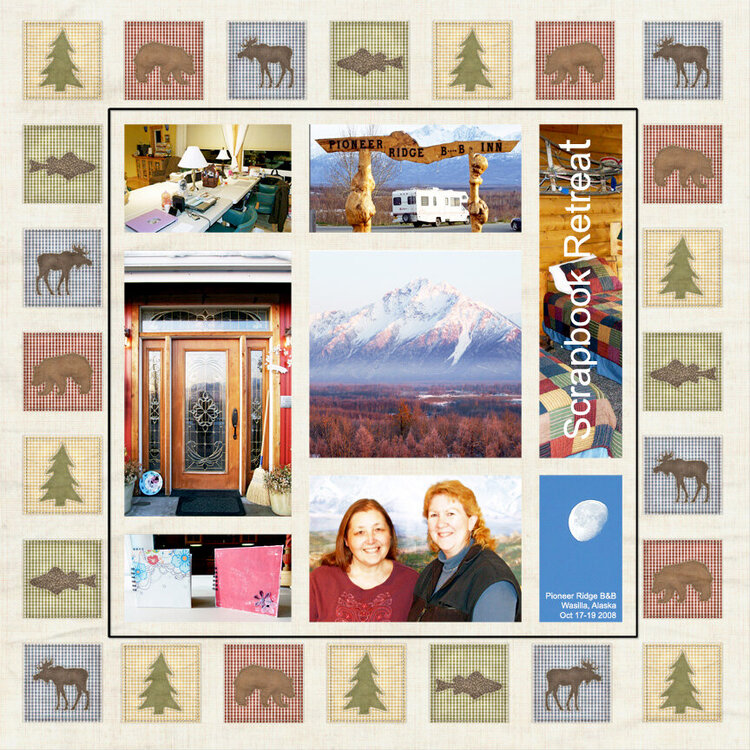
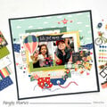
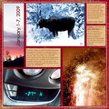
Last month, I attended a weekend scrapbook retreat with a dear friend and took quite a few photos.
Okay - 107.
Anyway, I put together this LO using 8 of those photos, but I'm not sure if I like this background paper. I chose it because of the cool Alaskan theme, which totally fits with the atmosphere and decor of the B&B where we had the retreat. I do like the paper, but I think it competes with the photos. I re-did the LO (which I will also post).
Which version do YOU prefer?
**All photos taken by me except for the one of my friend and I - that was taken by our new friend, Nancy S.
No products have been added to this project.

Thanks for spreading positivity!


November 12, 2008
November 11, 2008
November 08, 2008
November 08, 2008
November 08, 2008
November 08, 2008
November 08, 2008
November 08, 2008
November 08, 2008