I agree with Lellyne in everything. Love the design. The circles and the pics placement, the title letters are nice. Love the strips with brads and the little tags and ribbons, but I feel the color combo is overpowering the photos.
I love the title! I think that it would look nice to mat the pics to make them pop. Wow! I really really do love that title. The word Thrill looks so great on that orange circle. These pics are so fun. TFS! :)
Cool lo! LOVE the way you did the title. I too think the pics get lost in the bright colors a bit. I'm not sure if perhaps matting them might make them in white might make them stand out enough so you wouldn't have to change the cs color? Love the great photo arrangment too; great work :)
I also agree with the papers theme. But you do have some amazing photos that really need to be the focal point for your two pager. Don't change the design but only the papers. I so love the title and those pic's of course!! tfs!!
Your design is wonderful! I do agree that the colors are a little too powerful? If you still want to make use of the color scheme of the park, perhaps you can only use it as accents for the page. The base cs (the orange and lavender? one) can probably be changed to lighter shades of the same color. Cool title btw!
You know what's weird is my 12 yo son commented just today on the colors being too much. His comment was "the colors make sense to us because we were there and those are the colors in the Adventuredome, but I think they're too much for other people." I sort of disregarded his comment (I sometimes forget to pay attention to the wisdom of youth). Thanks, Lelynne, this is very helpful. (Note to all: would you say it's *all* the papers? Do you think the pps would work on a more neutral c/s base? Or start from scratch? TIA!)
great LO, Cindy! :) i love how you arranged the pics! ;) the only thing is, *i* think, the color scheme is overpowering the photos which are, *for me*, should be the focal point. so a less striking color scheme perhaps would be better. the pics are really great and i'd love to see them stand out here! :) the design is wonderful... i love how you offset one of the pics and also the circle pics make a fantastic complement to the other photos. ;) the story behind this 2-pager is wonderful! :) love it! :d
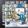
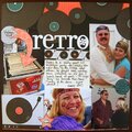
Critique group layout. This layout is based on a "blueprint" for a book publication call. I haven't decided whether to submit or not. I really like how the letters in the title turned out and the colors work well with the pix. Would appreciate some objective viewpoints.
Thanks in advance for your feedback.
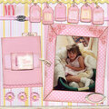
[b]SUPPLIES:[/b] Karen Foster Amusement Park Roller Coaster Orange and Carousel Pink patterned papers Bazzill Orange textured cardstock Bazzill Butterfly cardstock (Doodlebug) Bazzill Bubblegum cardstock (Doodlebug) Offray - narrow orange satin ribbon Orange twill - unknown Karen Foster Amusement Park Phrases Karen Foster Amusement Park tags Orange and purple brads unk. mfr Making Memories colored staples Making Memories foam stamps Jersey upper case Americana by Deco Art Craft Paint Cool White Pigma Micron 05 (Purple) pen Creative Memories circle cutter
[b]Journaling reads:[/b] Las Vegas, NV July, 2005
[i]The Adventure Dome at Circus Circus packs lots of excitement into a compact little amusement park. We got wristbands for Jake and Libby so they could get on as many rides as they liked and as often as they wanted. This was the first year Libby braved the roller coaster (shes finally tall enough!) She said she hated it and screamed the whole time.
None of us, though, was ready to take on Chaos. But we had fun watching.[/i]
Does this project or one of it's images contain pornography, profanity, or other illegal or offensive material? If so, please report it and our moderators will come by and clean it up in a flash.
February 13, 2006
December 21, 2005
December 11, 2005
December 09, 2005
December 09, 2005
December 09, 2005
December 09, 2005
December 09, 2005
December 09, 2005
December 09, 2005