Thank YOU! It's Customer Appreciation Week!
EXTRA 11% OFF Orders $100+ With Code: THANKYOU
EXTRA 11% OFF Orders $100+ With Code: THANKYOU

 Give a Cheer
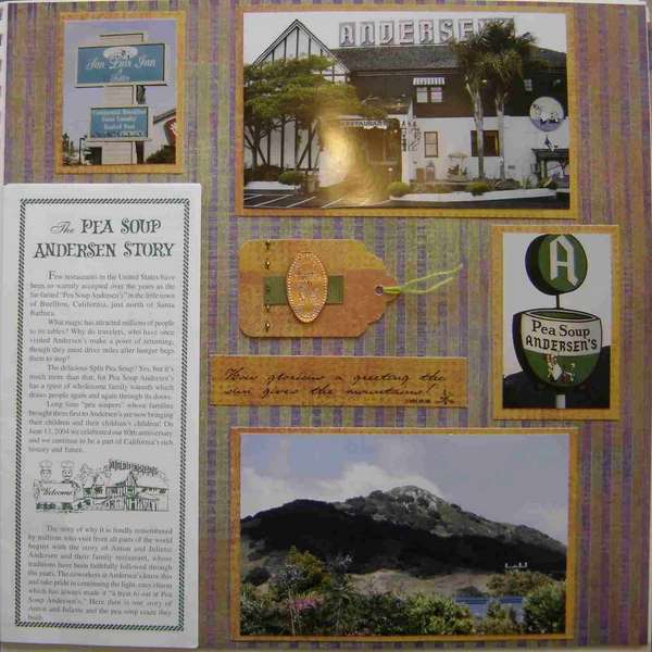
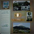
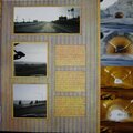
We stopped at a pea soup restaurant, which is a funny choice since I don't actually like pea soup at all ;) Fortunately, they served other stuff too.
No products have been added to this project.


Thanks for spreading positivity!

 Pea Soup%20-%20Scrapbook.com)


January 02, 2006
December 12, 2005
December 10, 2005
December 09, 2005