FREE Standard Shipping on Orders $69+ with code:
FREESHIPPING

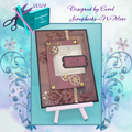
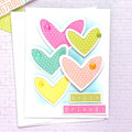
Cheers
Give a Cheer

 Give a Cheer
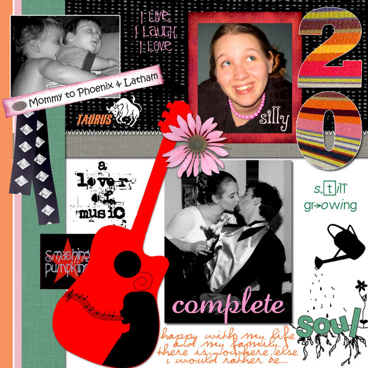
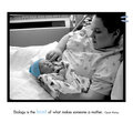
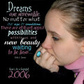
O.k., this is my very first time to participate in a challenge.. "Who Am I?" is the theme and this is the 2nd page to my 2 page LO for it. I will be up loading the first page soon.
Black folded ribbon is by
C Wallace, her Zoey Kit
Black textured background is by
Shabby Princess, the Kiwi Kit
Fonts used altogether for both los:
Your Sign, Flowerchild, Willy Wonka, Snickers, Vrinda, Eccentric Std., Dreamwish, Witched, Curlz MT, JACKIE, Infinite Sadness, Perpetua, Palatino Linotype, Piss off the Professor, Park Avenue, Ryp Child C, Poplar Std., Scruff LET, Scriptina, Scrawny Kids, Trash, Violation, Kristen ITC, Chemistry, Lauren Script, Freak, Uncle Typewriter, and Arial Black... Whew! I didnt realize that I used so many!!
and everything else is my own personal creation in Adobe Photoshop CS. TFL!!!
No products have been added to this project.

Thanks for spreading positivity!


March 14, 2006
January 02, 2006
December 22, 2005
December 21, 2005
December 15, 2005
December 15, 2005
December 14, 2005
December 14, 2005
December 14, 2005
December 14, 2005
December 14, 2005
December 14, 2005
December 14, 2005
December 14, 2005
December 14, 2005
December 14, 2005
December 14, 2005
December 14, 2005
December 14, 2005
December 14, 2005
December 14, 2005
December 14, 2005
December 14, 2005