Scrapbook.com Exclusives 20% to 60% OFF
Plus, Take 10% OFF Orders $100 or More! Use Code: CRAFTY
Plus, Take 10% OFF Orders $100 or More! Use Code: CRAFTY

 Give a Cheer
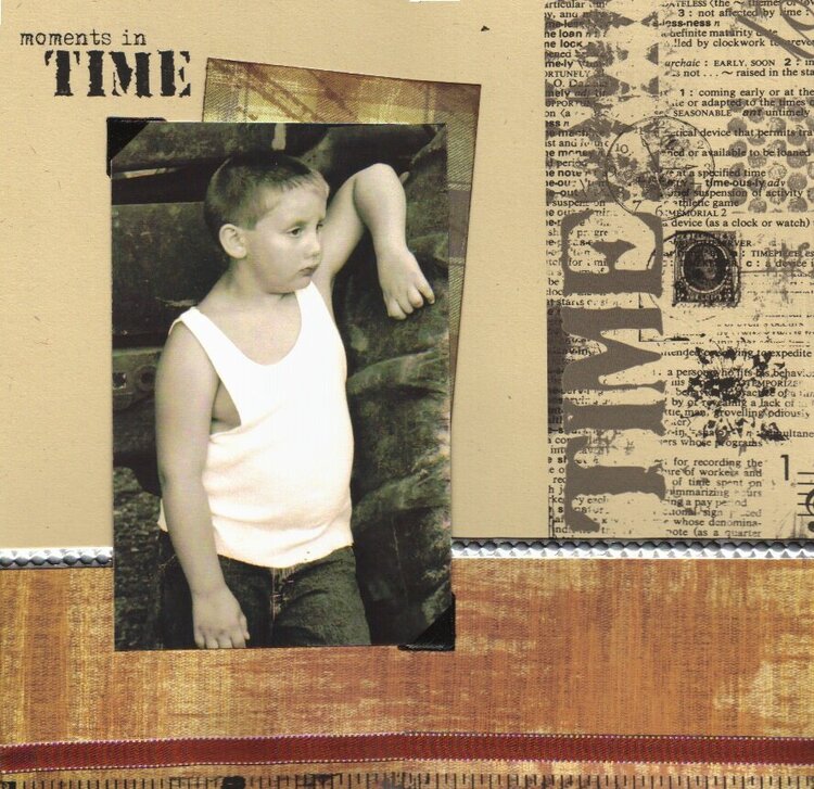
I decided to have this critiqued. There is just something missing in the bottom righthand corner.
This lo scanned horribly. Everything is actually cut straight. The metal that goes along the top edge of the paper scanned off color. The ruler at the bottom actually isn't crooked and runs the whole length of the page.
This is my ds, leaning on a tractor tire. He's such a country boy and I love it. This is one of my favorite pics of him. It isn't really as grainey (sp?) as it scanned. He looks like he just jumped down off the tractor after a long day out in the field. TFL!
No products have been added to this project.


Thanks for spreading positivity!


January 23, 2006
January 09, 2006
January 01, 2006
January 01, 2006
December 28, 2005
December 17, 2005
December 16, 2005
December 16, 2005
December 16, 2005
December 16, 2005
December 16, 2005
December 16, 2005
December 16, 2005
December 16, 2005
December 16, 2005
December 16, 2005
December 16, 2005