Storage & Organization up to 60% OFF!
Plus, a FREE Gift! | Details Here.
Plus, a FREE Gift! | Details Here.

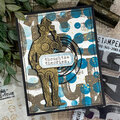
 Give a Cheer
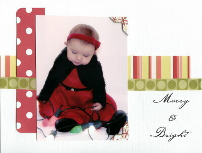
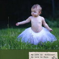
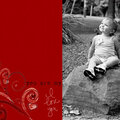
Lo of my DD Ava. I took this photo a couple days ago and I really love it. This lo I do not love so much. I am almost certain I will be redoing it ASAP. {{{sigh}}}
No products have been added to this project.


Thanks for spreading positivity!


January 18, 2006
December 21, 2005
December 21, 2005
December 20, 2005
December 20, 2005
December 19, 2005
December 17, 2005
December 17, 2005
December 16, 2005
December 16, 2005
December 16, 2005
December 16, 2005
December 16, 2005
December 16, 2005
December 16, 2005
December 16, 2005
December 16, 2005
December 16, 2005
December 16, 2005
December 16, 2005
December 16, 2005
December 16, 2005
December 16, 2005
December 16, 2005
December 16, 2005
December 16, 2005
December 16, 2005
December 16, 2005
December 16, 2005