Fun photos, and I love the string idea! I definitely agree with a darker mat - I don't think the LO is too symmetrical at all, in fact the symmetrical arrangement is great, but I didn't actually notice it until I read you notes! I think making the mats more contrasted would show off the photo arrangement better - I really do think it's very cool.
Oo...the pix are gorgeous and the string is a cool idea.
I agree with the rest, maybe matting with a darker cardstock will create a contrast. Also maybe add a bit more embellies to bring the photos together.
Oh I love the string, what a great idea!! Maybe if you matted the pics with cardstock, a darker cs that coordinates with the BG line? I think that might make a world of difference. I feel like I'm going on this trip with you and I love it!!!!
Sounds like fun! The LO just looks a little busy. Maybe try matting with a darker color so the mats don't blend in with the patterned paper. The string is a different element...I like it. Have you thought of numbering the circles on each photo? Loving this trip!
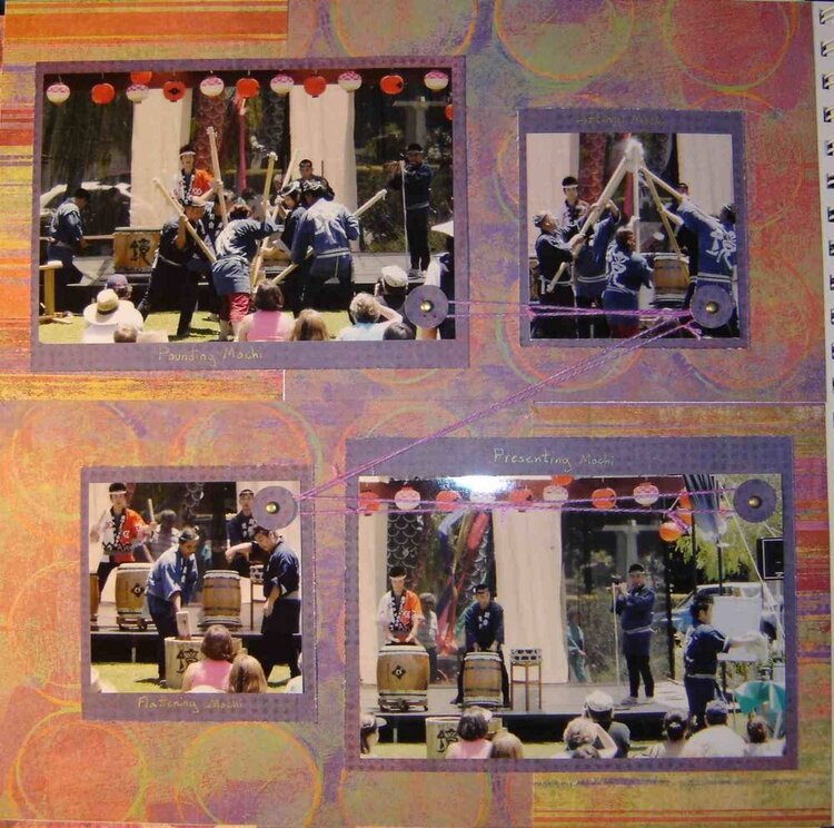
With this layout, I was trying to display pictures showing how mochi was made during a Japanese festival we went to. I labeled the mats with what was happening (pounding, lifting, flattening, presenting) and used some string to show the order.
But somehow it just doesn't work. Maybe it's too symmetrical? I don't know, I just know that it doesn't feel interesting, even to me!
Does this project or one of it's images contain pornography, profanity, or other illegal or offensive material? If so, please report it and our moderators will come by and clean it up in a flash.
April 11, 2006
January 04, 2006
January 02, 2006
January 02, 2006