shcg: how interesting this is i like looking at it and the colors are wonderful. the only thing i see is the red accent flower on the frame overwhelms your face a little.
SHCG: I love how you turned random pp into a great LO! I think you did awesome with this, but I would suggest not putting the title on the red strips. I like the large life and highway with the small words cut from the pp, but I would use white/offwhite letters for the larger words and put them directly on the background cs. As is, I just think it detracts from the journaling strips. Very nice LO!
SHCG: Jen, the contrast between the traffic sign pp and the roses brings such unexpected interest to your page. I like the deeper symbolism behind your choices, too. The lyrics are also a perfect accompaniment. I have a few suggestions. I feel like Life should be in a thicker font, while Highway should be slanted to denote how changes come at you fast and in a blur. To heighten the contrast between the pps, I'd tear the left and right edges of the traffic pp. I like the rose cut-out, and I think it might be cool to doodle some thorny flourishes over the top and right sides of the photo to play up the metaphor. I agree with adding a mat to your photo, too. Finally, I think the red for the journaling strips is too dark. Instead I suggest printing on white or creme, and keep the red as mats for each strip. It could also look really cool to shape these red mats with arrow tips pointing in different directions, but still guiding us to key elements of your page. Nice use of hidden journaling and the ribbon pull tab. I like the soft texture that the ribbon adds to the lo. You've done a great job with these "ugly" pps. I appreciate you sharing such a vulnerable time in your life with us.
SHCG - WOW, Jen, it's so moving to read about this LO. I love how the combination of the greys/blacks w/ the pinks & flowers, really capture both an edginess & tenderness here, I imagine similarly to your real-life bittersweet situation. The pp is excellent here... I would never guessed this was for an ugly paper challenge. While I can see you matting the photo as Tiff mentioned, I see it more in black, or maybe black inking. I could also see that around the title & journaling strips but that's just my preference as an ink-addict. And I would like the date somewhere - on the hidden journaling, on the back, wherever. This is lovely, personal & marvelously scrapped, Jen, kudos on a job well done both in real life & in this LO! :o)
SHCG: Well Jen there's nothing ugly about this LO. I'm sorry you had to go thru that but glad that doing this LO helped you. You made all these papers work together so well and the title goes perfectly with that paper also. I agree with Tiff to matte the picture with another color, but it looks fantastic. Hugs, Marlene
SHCG: Jen, *hugs*, girl! I am so glad that you were able to use this layout as a therapeutic release. I love that this is a challenge to use ugly papers and I love that you paired these unlikely papers together. In my defense, I would like to explain that I normally mount the heck out of photos, titles, anything that can be mounted. Wait, that didn't come out right. *wink* I would suggest that you mount the photo on some white/offwhite cardstock and then mount it on that floral paper. I just want the photo to stand out a bit more and the flowers overpower it a bit. That might also provide you an opportunity to create a pocket for the hidden journaling. My eyes want something across the bottom of the layout. Perhaps a series of arrows along the bottom ribbon, overlapping the street sign panel? Finally, I'd love a date visible. Jen, this is a beautiful layout and I am a huge fan of getting things out in scrapping, girlfriend. I am proud of you for becoming the woman you are today! :)
shcg: I agree with the commenter below about this being great therapy you being able to reflect on that time. Hidden journaling is wonderful for that. This is such an odd combination of papers, and yet it works so well for what you're trying to achieve. Awesomely done page.
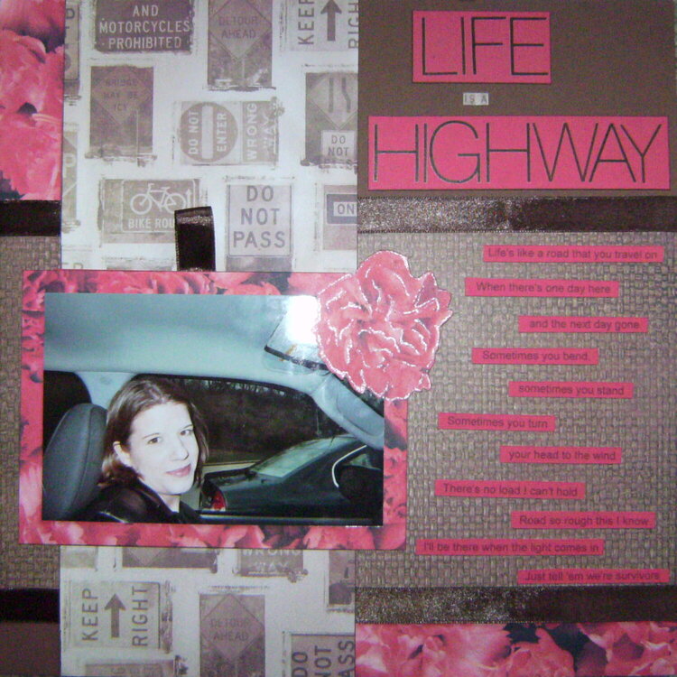
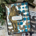
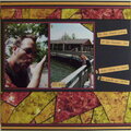
For the Feb. Ugly Paper Challenge - the street sign paper and rose paper is what I received.
I noticed after uploading that the photo is slightly crooked and have fixed that!
The large title letters are AC rubons and the smaller letters were cut from one of the signs in the patterned paper. I lined the large rose on the picture with Stickles to make it stand out a bit (the flash on my camera makes it look more prominent than it actually is).
The red journaling strips are lyrics to the song, and there is a spot for hidden journaling (which is written but not yet added to the LO) behind the photo. This was just a random snapshot taken in a parking lot on a weekend trip with my now ex-husband - it was a mini-getaway that we were hoping would help us move towards fixing some issues - it didn't - hence the private journaling :). I originally chose the photo because it sort of went with the street sign paper, but after looking at it and remembering that weekend and everything that eventually followed, the LO turned into something deeper.
Does this project or one of it's images contain pornography, profanity, or other illegal or offensive material? If so, please report it and our moderators will come by and clean it up in a flash.
March 26, 2009
March 12, 2009
March 12, 2009
March 08, 2009
March 01, 2009
February 28, 2009
February 28, 2009
February 24, 2009
February 24, 2009
February 23, 2009
February 22, 2009
February 22, 2009
February 22, 2009
February 22, 2009