
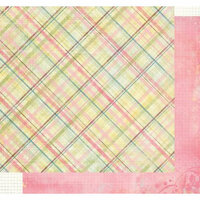
%20-%20Scrapbook.com)
FREE Standard Shipping on Orders $69+ with code:
FREESHIPPING

 Give a Cheer
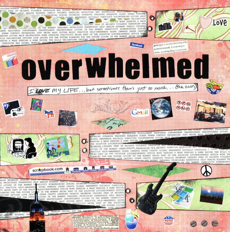
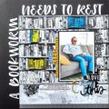
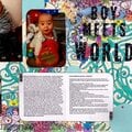
This is my response to MaRLeNeF's One Word Challenge for Scrap Happenzz Critique Group to scrap one word without pictures (Marlene, I assumed you meant no photos as your example had some very CUTE pics/images. I kinda messed up, I just realized that there ARE tiny photos in my response but they're not PHOTOphotos, as in photos of mine
hope that's okay!)
Yup, this word pretty much sums it up for me these days, most days
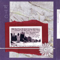
Design-wise, this was a lift of a LO in the 12/07 Scraptivity Notions Newsletter (no artist named, you're supposed to guess, for a prize, which DT member did which page
). I'm still getting the hang of my Big Bite so I screwed up a couple of the eyelets here; I think that worked to convey the feel of this, LOL. Same w/ the foil rub-on in the center, it was the kind where you rub on the adhesive 1st then the foil, it came off a little botched-lookin, which works. It is also shinier IRL, as is the heart pp & the guitar. Most the images are self-explanatory though I'll point out that the photo in the right center is of the outdoor food pantry in Brooklyn where I volunteered MLK weekend (outside in single digit weather
freezing but very fulfilling). The scrap of black cs in the bottom wedge was one of my rejected bleach pen doodling experiments (which I did for my "Toe Side Triumph" LO).
I pretty much brainstormed for 2 days to figure out what to put on my text pp, here's a list of what's there: SELF HEALTH HUSBAND FAMILY FRIENDS EXERCISE NUTRITION ART EXPRESSION FULFILLMENT HAPPINESS CONTENTMENT GRATEFULNESS PEACEFULNESS LIVING IN THE MOMENT CREATIVITY SCRAPBOOKING HIKING SPINNING STRENGTH TRAINING ADEQUATE SLEEP HUMAN CONTACT RECHARGING JUST BEING BASS GUITAR MUSIC PRACTICE SELF-AWARENESS GOING INWARDS PAPER CRAFTS GLOBAL AWARENESS SOCIALLY CONSCIOUS VOLUNTEERING GIVING BACK MAINTAINING HOME CHOOSING POSITIVITY BEING PART OF THE SOLUTION LOVINGKINDNESS OFFICE WORK EARNING A WAGE KEEPING A HOME PAYING THE BILLS OBLIGATIONS OPTIONS LOVE CROCHET OTHER CRAFTS LEARNING TAGALOG SWIMMING LESSONS FEAR OF HEIGHTS VIOLENCE TERRORISM WAR GLOBAL WARMING SAVING FOR THE FUTURE PLANNING FOR THE FUTURE LIVING IN THE MOMENT PERSONAL PRINCIPLES PARENTHOOD I had to cut myself off because I knew I could brainstorm for a month on what to include, LOL. I also put the text on the back so I could read fully what I put in the future. Pardon the imperfect scan, which leads to text overlapping on one of the text wedges (it doesn't do that IRL).
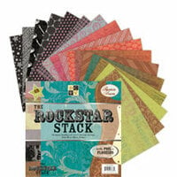
The Big Bite was bought w/ a Valentine's GC from Eat Sleep Scrap, the Rock Star Stack was a Christmas gift from whenscraphappenzz, the Empire State Bldg sticker a RAK from twinscrapbee, the Creative Imaginations screw stickers a bday gift from either whenscraphappenzz or Sosumi san, & the eyelets a bday gift from Wacky Watson thanks Melissa, Tiffany, Brenda, Angela & Sarah!
This was like therapy, thanks you Marlene, for a wonderful challenge!
TFL :)


Thanks for spreading positivity!


March 26, 2009
March 21, 2009
March 08, 2009
March 05, 2009
March 04, 2009
March 03, 2009
March 01, 2009
February 26, 2009
February 26, 2009
February 25, 2009
February 25, 2009
February 25, 2009
February 25, 2009
February 25, 2009
February 25, 2009
February 25, 2009