It is a wonderful layout as it is. If you shrink it down to 6X6, the words will still not be too small. I would not change the color of the ribbon, it is very nice. You could put some of that ribbon on the right page, and shrink the journaling mat a little. It is not plain. It focuses on the beauty that is in the toddler, and the wonder with which he sees the world. That's what the grandparents want to see. You could add some eyelets, on the journaling mat, but you don't have to. I don't think I would use an orange that is brighter than his hair.
No, not too plain at all!!! I agree though, on flipping "pumpkin". I always try to make sure that things on the outside face toward the inside. In other words, if "pumpkin" was on the other page, it would've been fine. Great job!!
I don't think it's to plain at all. In fact, I love it! The only thing I would change (and it's just my personal preference) is swap the word 'Pumpkin' to be facing the other way. I don't know why, but I always read vertical stuff from the right instead of the left.
I did a 6x6 paper album for my gmil for Christmas last year and thought stuff was going to be to plain as I was planning in my head but at that size it was just right.
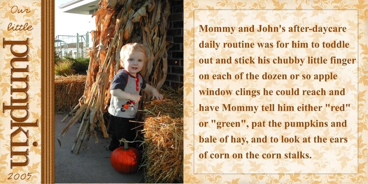
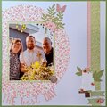
I did a second version of this layout. The first I'll print as a 12 x 12, but I also plan on printing a smaller version for grandparent albums and thought the journalling would be too small if I just shrunk the 12 x 12 version. Is this too plain? I might try changing the ribbon to pumpkin orange and adding orange eyelets to the page on the right in the corners of the "vellum"? Thoughts? Comments?
Journalling is the same as the other.
Mommy and John's after-daycare daily routine was for him to toddle out and stick his chubby little finger on each of the dozen or so apple window clings he could reach and have Mommy tell him either "red" or "green", pat the pumpkins and bale of hay, and to look at the ears of corn on the corn stalks.
All elements and papers used are by Shabby Princess. Ribbon is color altered and pieced together to make a longer ribbon. Fonts used are Times New Roman and CK Cursive. Software used is GIMP.
Does this project or one of it's images contain pornography, profanity, or other illegal or offensive material? If so, please report it and our moderators will come by and clean it up in a flash.
July 23, 2006
January 04, 2006
January 04, 2006
January 04, 2006