FREE Standard Shipping on Orders $69+ with code:
FREESHIPPING

Cheers
Give a Cheer

 Give a Cheer
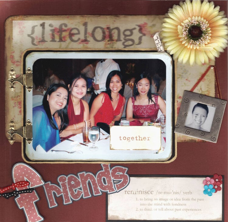
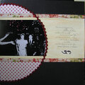
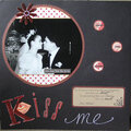
Here's my revised page. The colors look dark in the scan. It's so 3-dimensional so there are so many shadows all over! The bottom portion was cut during the scan.
Anyway, I distressed the red and black ribbons on the f, added a blue prima, added pic of my friend and placed a brad and ribbon. Also, added the daisy. The ribbon on the frame is actually not that red, more of burgundy color (her theme color for the wedding).
Also used gold leafing pen on the edges of the black mat. Just don't know if it looks good that way or just plain black. What do you think? Should I paint the metal frame gold?
Hope you ladies like the changes!
No products have been added to this project.


Thanks for spreading positivity!


February 19, 2007
November 28, 2006
August 31, 2006
August 22, 2006
February 18, 2006
January 06, 2006
January 04, 2006
January 04, 2006
January 04, 2006
January 04, 2006
January 04, 2006
January 04, 2006
January 04, 2006
January 04, 2006