

Card Making up to 60% OFF
Plus, a FREE Gift! | Details Here.
Plus, a FREE Gift! | Details Here.

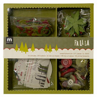
 Give a Cheer
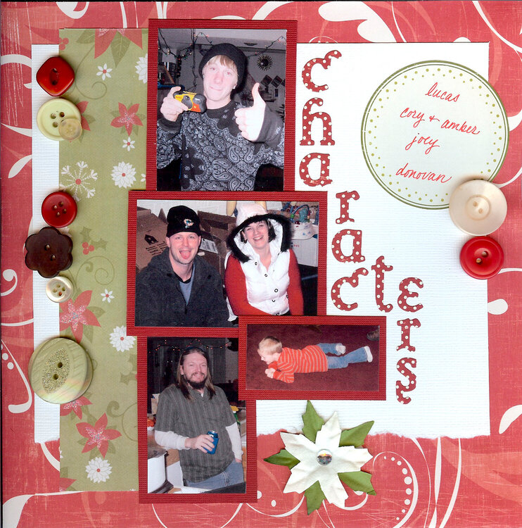
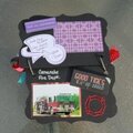
Christmas day at my bf's dad's house... assorted members of his family. Again no journaling because it's in a Christmas only album and I don't wanna!

Thanks for spreading positivity!


April 17, 2009
April 15, 2009
April 10, 2009
April 06, 2009
April 04, 2009
March 31, 2009
March 30, 2009
March 29, 2009
March 29, 2009