
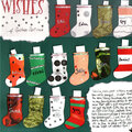
 - SHCG "Keeping This Place Open/Where I Shop" Challenge%20-%20Scrapbook.com)
FREE Standard Shipping on Orders $69+ with code:
FREESHIPPING

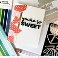
 Give a Cheer
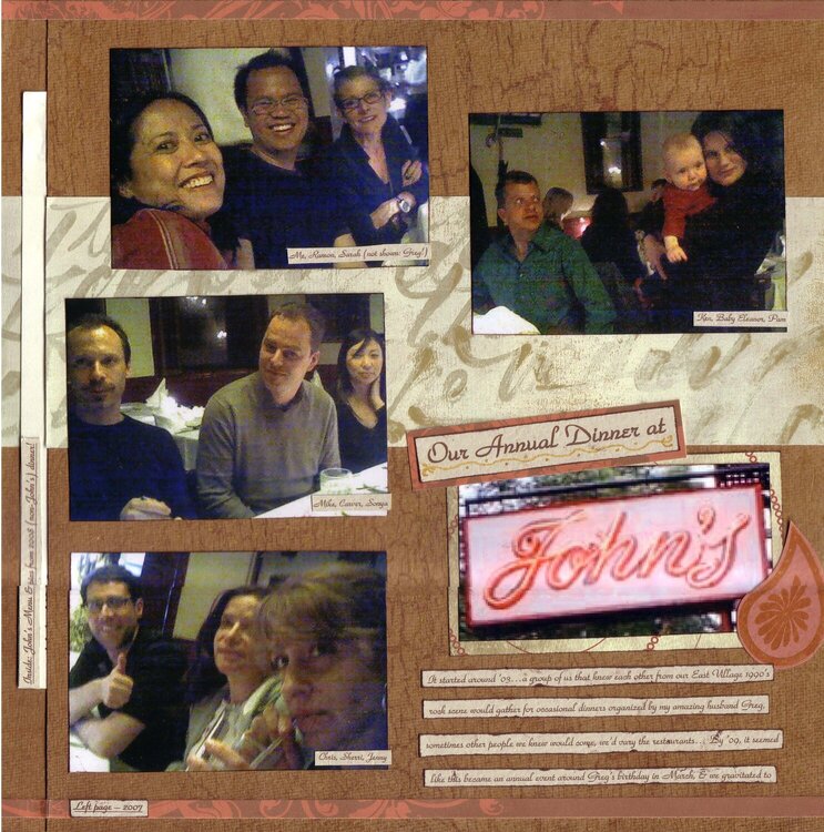
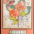
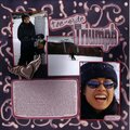
This is my response to Eat Sleep Scrap/Melissa's Doing My Part To Keep This Place Open challenge about an establishment (store, restaurant) that we like to frequent. My friends & I meet for an annual dinner & over the years, we've gravitated towards having it at John's of 12th Street, we love it there! So the left side are pics from '07's dinner & the right side are from this year.
This was lifted from/inspired by Whispering Canyon Cafe by lorifl2 on Twopeas.
The left side is a pocket page that holds a John's menu. It also holds pics from '08's NON-John's dinner
I was scrapping our annual tradition as much as I was scrapping John's here & I didn't want those pics to be left out! I added gold gel pen doodling (kind of hard to see here, shinier IRL), which even I thought was an unusual choice, but this looked so serious before I did that! And our friends & I mostly know each other from a rock music scene so I had to lighten this up w/ some whimsy
SHCG Peeps I'm open to suggestions on adding some dimension here, I'm not sure what to do about that. Everything's glued down so I'm limited only to additions
Journaling: It started around '03
a group of us that knew each other from our East Village 1990's rock scene would gather for occasional dinners organized by my amazing husband Greg, sometimes other people we knew would come, we'd vary the restaurants
By '09, it seemed like this became an annual event around Greg's birthday in March, & we gravitated to going to John's of 12th Street. John's is a straight-up awesome Italian restaurant no frills, not touristy, old school, dark & candlelit
So great for groups not a lot of the requirements that some places give large groups, they're soo accommodating its-a-no-a-problem-a- we put-a you-a a nice-a longa ahhh taablle in the backa-a
everyone-a togthera... Most of all - the scrumptious food! Everything's tasty. Recently I had black truffle ravioli in butter sauce yum. --- We often talk about going to other places for our annual dinner, & sure we're open for that possibility. But not sure how much we're willing to mess w/ a good thing a springtime dinner at John's is a pretty unbeatable tradition! :)
All the left side pics & the top right side pic were taken w/ a cell phone, hence the photo quality. The "John's" sign was a photo I found online. Please pardon the imperfect stitching/scanning, which crops out the edges.
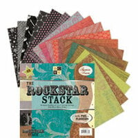
The Rock Star Stack was a gift from Tiffany/whenscraphappenzz thanks Tiff!
TFL :)

Thanks for spreading positivity!


April 27, 2009
April 26, 2009
April 23, 2009
April 23, 2009
April 10, 2009
April 08, 2009
April 08, 2009
April 08, 2009
April 08, 2009
April 08, 2009