Stamps, Inks, & Stamping Accessories on SALE!
Take 9% OFF orders $100 or more with code: SPRING
Take 9% OFF orders $100 or more with code: SPRING


 Give a Cheer
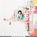
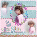
kit hillside morning
No products have been added to this project.

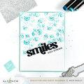

Thanks for spreading positivity!


May 22, 2009
May 05, 2009
May 04, 2009
May 02, 2009
April 30, 2009
April 30, 2009
April 27, 2009
April 26, 2009
April 26, 2009