Thank YOU! It's Customer Appreciation Week!
EXTRA 11% OFF Orders $100+ With Code: THANKYOU
EXTRA 11% OFF Orders $100+ With Code: THANKYOU

 Give a Cheer
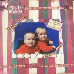
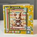
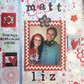
My sisters twins.. arent they darling..
New Karen Foster Christmas paper.. frazzles by GBOF
No products have been added to this project.

Thanks for spreading positivity!


January 19, 2006
January 17, 2006
January 13, 2006
January 11, 2006
January 11, 2006
January 11, 2006
January 11, 2006
January 11, 2006
January 11, 2006
January 11, 2006
January 11, 2006