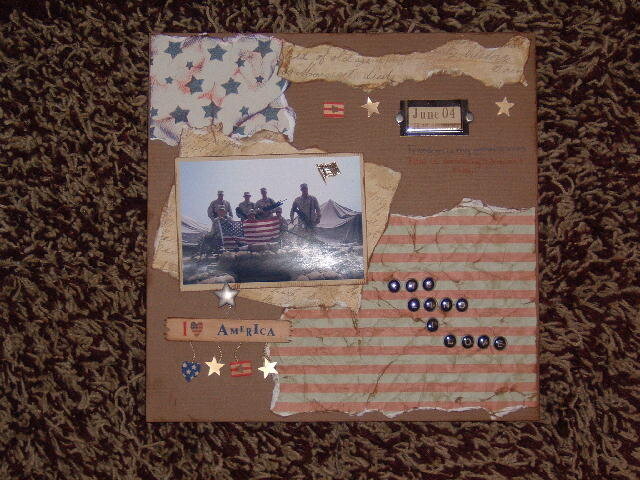
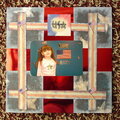
I like the composition. The flow of the paper from the top of the page through to the bottom flag paper. It makes the eye move right to your central photo. I agree with the others that the lettering is hard to read and needs to be larger or clearer. Good work.
I really like the overall look of this, the paper tearing is awesome and so is the inking. I think I agree with Cath about adding some red or blue paper -- especially as matting to the picture -- I think it will really those wonderful soliders stand out :) I love the America tag -- so cute. :)
ooh WOW love this! You did a great job! It is really hard to see the word on the flag, if it is that ard to see them irl you may think about moving them.
Wow this is so great! Love the distressing you did on the papers. I would suggest putting the words under the date on some torn paper, to make them stand out more. Really great job on the inking on the crumpled paper!
The way you positioned the stars and stripes paper really go well with the flag in the picture. I might add a frame or matting around the words under June 04 to make them stand out.The torn edges on all the paper really give it a nice touch.
Ok first let me say WOW..I love the stripes and the upper stars paper the way you positioned them..again I love the idea of double matting the photo to give it more of a presence on the page.. I also love the hanging embellis and would prob mat the i love America tab.. the backround works really well, but I wonder what deep red or true blue would do for your work? just a thought tfs
Does this project or one of it's images contain pornography, profanity, or other illegal or offensive material? If so, please report it and our moderators will come by and clean it up in a flash.

 Give a Cheer


January 31, 2006
January 12, 2006
January 11, 2006
January 11, 2006
January 11, 2006
January 11, 2006
January 11, 2006
January 11, 2006
January 11, 2006