Thank YOU! It's Customer Appreciation Week!
EXTRA 11% OFF Orders $100+ With Code: THANKYOU
EXTRA 11% OFF Orders $100+ With Code: THANKYOU

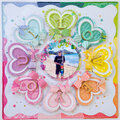
 Give a Cheer
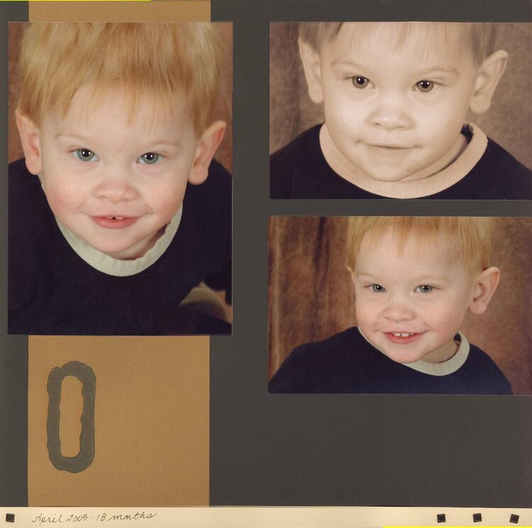
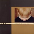
Cardstock, brown, black & beige Pacon
Square Brads - MM
Stamp MM foam stamp used the zero instead of the O because it was bigger
Paint - MM
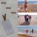
This is my most recent layout. I love the colours in my sons hair in the summer, he had a lot of red and very blonde highlights. I thought this brown paper really brought them out. I have done a lot of computer / rub on / sticker lettering in my scrapbooks and it a goal of mine to do more handwriting, here is a very small start with that.
Left Page
Although it doesnt show here there is a small band of black at the very bottom. The strip of beige is about an inch wide and is about an inch from the bottom of the page. It is attached with 1 black square brad on the left and 3 on the right. Also, there arent white bits at the edges of the photos, I think this is due to a bad stitching job in my scanner software. It is brand new to me so bear with the shoddy results.
Journal: April 2005 18 months
No products have been added to this project.

Thanks for spreading positivity!


April 30, 2006
January 21, 2006
January 21, 2006
January 18, 2006
January 18, 2006
January 18, 2006
January 18, 2006
January 17, 2006
January 17, 2006
January 17, 2006
January 17, 2006