
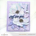
Happy National Scrapbook Day!
Extra 10% OFF Select Scrapbooking Brands with Code: NSD24
Extra 10% OFF Select Scrapbooking Brands with Code: NSD24

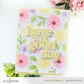
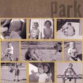
 Give a Cheer
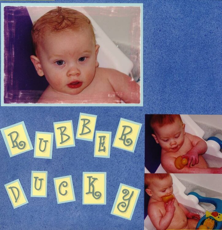
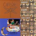
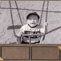
Because I am so far behind in my scrapbooking (my son is 2 1/5 and I just finished his 1st birthday) I feel some of the pages I do are duty pages. Pages just because
not because I really want to, but feel I should do. This is one of those layouts. We took a lot of photos of my son in the bath and so I feel obligated to scrap some of them.
I wanted to try a new technique here sanding the edges of the photo. I have always admired this on other peoples layouts either here or in magazines. So I did it. But I am not happy with the results at all. I am not sure if I went overboard or if this just wasnt the right photo for it.
Left Page:
Rubber Ducky printed on yellow cardstock then matted with blue
Blue Paper CM Perfect Fit
Light Blue cardstock used for mat on left page Bazzill
Yellow cardstock used behing lettering Bazzill
Computer Fonts
Angelica (with shadow effect in MS Word) poem & rubber ducky title
Marker fine point plain right page information in bottom right of poem
Layout Becky Higgins Sketches
Duck not sure of brand got it at WalMart
No products have been added to this project.
Thanks for spreading positivity!


April 30, 2006
January 18, 2006
January 17, 2006
January 17, 2006
January 17, 2006
January 17, 2006
January 17, 2006
January 17, 2006
January 17, 2006
January 17, 2006