FREE Standard Shipping on Orders $69+ with code:
FREESHIPPING

Cheers
Give a Cheer

 Give a Cheer
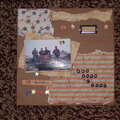
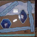
this is the one I did for the jan sketch challenge.( just wanted to show ya)
No products have been added to this project.

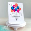

Thanks for spreading positivity!


January 31, 2006
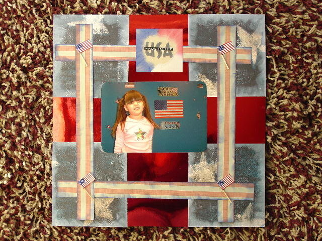
January 14, 2006
January 14, 2006
January 13, 2006
January 13, 2006