FREE Standard Shipping on Orders $69+ with code:
FREESHIPPING

Cheers
Give a Cheer

 Give a Cheer
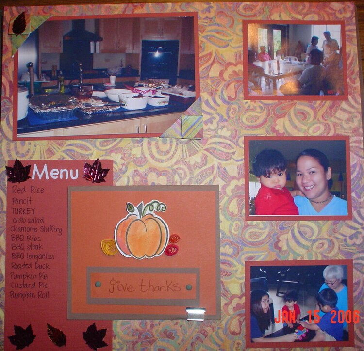
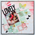
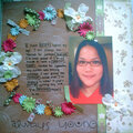
My LO of Thanksgiving 2005
Journaling is hidden behind the pumpkin card. Here's what I have a question about--
I used the tea bag folding technique to make the photo corners on the main picture.
1. Should I leave them?
2. If I leave the corners, should I keep the ones I have or make ones in a different color, maybe solid?
3. If I toss the corners, do I need to add anything else or am I DONE?
Thanks for all your help!
No products have been added to this project.

Thanks for spreading positivity!

![What's in a name? [re-done]](https://www.scrapbook.com/gallery/cache/4/42239/DSC01844_edited_120s.JPG)


April 28, 2006
February 14, 2006
January 20, 2006
January 16, 2006
January 16, 2006
January 16, 2006
January 15, 2006