

Thank YOU! It's Customer Appreciation Week!
EXTRA 11% OFF Orders $100+ With Code: THANKYOU
EXTRA 11% OFF Orders $100+ With Code: THANKYOU

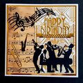
 Give a Cheer
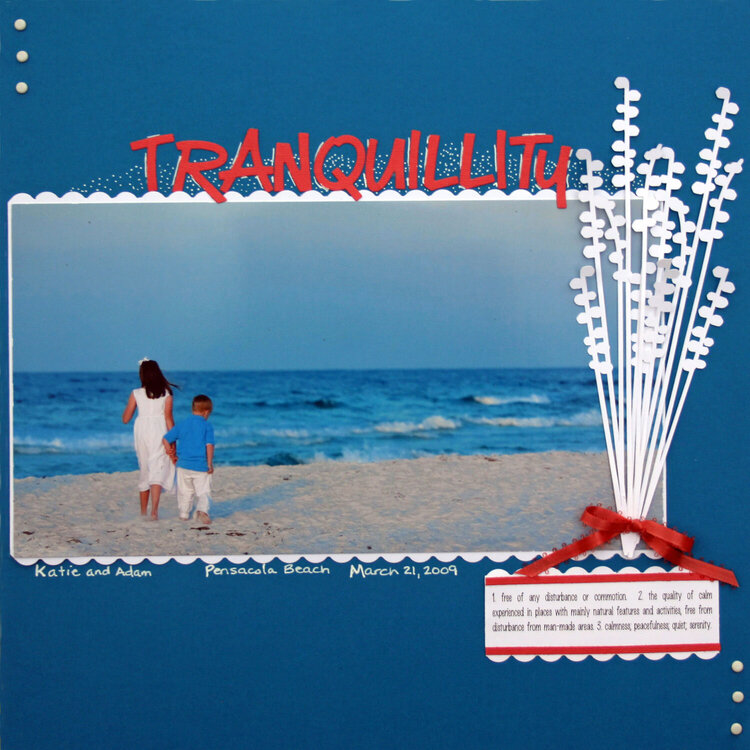
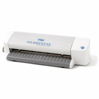
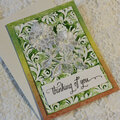
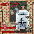
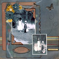
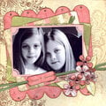
My DGC, Katie and Adam at Pensacola Beach - March 21, 2009. This is a super simple layout that I actually did in about 30 minutes last night. The white "plant" was cut with the Silhouette. I put a scalloped edge on either side of the 6x10 photo. The title work is a QK font - Marker (?) The paper for the title work is actually a dusty pink color...not sure why it looks orange here. The journaling block on the bottom is definitions of tranquillity that I found online. I added three white brads in the upper left and lower right corners for balance, and tied a bow at the base of the plant. The definitions for tranquillity are:
1. free of any disturbance or commotion. 2. the quality of calm experienced in places with mainly natural features and activities, free from disturbance from man-made areas. 3. calmness; peacefulness; quiet; serenity.
Note: When I finished adhering the title, I decided that the title looked like it was spelled wrong so I looked up the spelling of tranquillity. It is actually spelled with 2 "L's", but is sometimes spelled with one "L"...and...since I'd already done the doodling around the letters...it will keep the 2 "L's". LOL!!!

Thanks for spreading positivity!


December 03, 2009
August 28, 2009
August 14, 2009
August 08, 2009
August 05, 2009
August 05, 2009
August 03, 2009
August 03, 2009
August 02, 2009
August 02, 2009
August 01, 2009
August 01, 2009
July 31, 2009
July 31, 2009
July 30, 2009
July 30, 2009
July 29, 2009
July 29, 2009
July 29, 2009
July 28, 2009
July 28, 2009
July 28, 2009
July 28, 2009
July 27, 2009
July 27, 2009
July 26, 2009
July 26, 2009
July 26, 2009
July 26, 2009
July 26, 2009
July 26, 2009
July 26, 2009
July 26, 2009
July 25, 2009
July 25, 2009
July 25, 2009
July 25, 2009
July 25, 2009
July 25, 2009
July 25, 2009
July 25, 2009
July 25, 2009
July 25, 2009
July 24, 2009
July 24, 2009
July 24, 2009
July 24, 2009
July 24, 2009
July 24, 2009
July 24, 2009
July 24, 2009
July 24, 2009
July 24, 2009
July 24, 2009
July 24, 2009
July 24, 2009
July 24, 2009
July 24, 2009
July 24, 2009
July 24, 2009
July 24, 2009
July 24, 2009
July 24, 2009
July 24, 2009
July 24, 2009
July 24, 2009
July 24, 2009
July 24, 2009
July 24, 2009
July 24, 2009
July 24, 2009
July 24, 2009
July 24, 2009
July 23, 2009
July 23, 2009
July 23, 2009
July 23, 2009
July 23, 2009
July 23, 2009
July 23, 2009
July 23, 2009
July 23, 2009
July 23, 2009
July 23, 2009
July 23, 2009
July 23, 2009
July 23, 2009
July 23, 2009
July 23, 2009
July 23, 2009
July 23, 2009
July 23, 2009
July 23, 2009