SHCG: probably because I do so many sport pages but my first though was to add an article about his sporting events (even if you have to make one up on the computer). "heading" the school name, "article title" his name, year, and the activity (also doubles as a title) "article" write about some of his events (also doubles as the journaling). Maybe next time...
SHCG: Okay, I read all the other suggestions first. I'm glad I did. I really like the fibers myself. It makes this page so unique. I do agree that they overpower your photo though. I would do a triangular layered mat under your photo to make that part of the page really dramatic. Using one of the pps from Basic Grey Ambrosia or Archaic that look like 70s wallpaper would be cool with a smaller triangle in a solid on top. Then I'd angle your photo so that it is mostly on top of the big dramatic triangle that is now your negative space, but tuck it slightly under the first string. A little off to the right would be nice with journaling on the pp itself around the photo. Did that make sense? I LOVE where this is going.
SHCG - Like Brenda said, you've gotten good feedback so far; I really like the example she posted & the idea of the fiber replacing the green pp in it. But before I read what she wrote, I was envisioning something else. As others have stated, I think the fibers, while cool looking, do take away focus from that fantastic vintage pic. So, since the photo is smaller, adding a 2nd & maybe even a 3rd paper matte would be a great start to make sure the pic gets adequate accent. Then, remove the top few fibers (because it is a bit fiber-heavy) & move the photo into the lower left hand corner (same margins as now, but just on diagonal opposite side of page); that way you could use the focus the fibers gets to sort of "matte" your photo. Then, in the space remaining on the upper right (where the photo is now & would be moved from), add a small block of journaling. I say "small" because having the negative space up there in the upper right would emphasize the pic in the lower left even more. And maybe you could still use the bracket then, to accent the journaling block. I like how you used the fibers to "tie" (LOL) into the title. Great ideas & start, Michelle! :)
SHCG: You've gotten a lot of really good feedback, so I'll try to offer up something a little different. Since your photo is faded, it really needs more attention drawn to it, so I really think it needs to be more centered, with a bigger title and some journaling that allows us to zero in on the photo. I went to the gallery, looked at los with one photo, and found Mstrace's Kindergarten to be a good design to consider. http://www.scrapbook.com/gallery/image/layout/2317617.html Where she has that green pp block, I can see your fibers laid horizontally instead, suggesting a rectangular spae. I'd also go with less embellies than the link. Looking at sketches can really help, too. Otherwise, would you consider a smaller page size?
SHCG:I think that the pic is great, it shows the era very well...I agree too about the fiber seems a little one sided BUT I also like what Marlene said about tucking the pic into the fiber :)
SHCG: The colors af the photo and the pp and fibers work very well together! I don't think the photo is too small for the page. I think the fibers like that are a little bit overwhelming -I would leave 3 in the corner , remove the rest and put 3 more in the top left corner. Move the bracket just a little bit down and flip it so it points toward the photo. Then you can put a title on the other side of the bracket. Some journaling would be nice too. You can draw some lines right under the photo and use white pen for the journaling. I can't wait to see the final page!
SHCG: I sort of like the fibers, very different. I would move the picture and tuck it between the fibers and also would add a title and some journaling :)
shcg: I think I would get rid of the fibers and try more of a negative space effect. Also maybe some journaling. Maybe somethings about your brother. Great pic.
SHCG: I personally think the fibers are too much. I'd get rid of them and add some journaling and a title. I think you can definitely make do with this one photo. Perhaps move the bracket elsewhere on the page and fit some lines inside it to journal on. Also a patterned paper of sorts may work as a backing or to cut smaller squares out of.
shcg: hmmm.... I can understand where you feel stuck on this. I'm wondering if you could add a journaling block to tell about your brother in order to fill the space. I'm not feeling all of fiber. This page also feels like it needs a title. Just some thoughts. I love the colors you're using here.
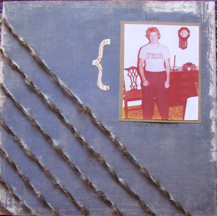
I had one photo of my brother from 1978 and the color quality was not very good, so I didn't want to blow the picture up. that left a ton of space on this page. I found some string/yarn with similar colors as the cardstock to fill the gap. any suggestions on what might or could be added to this page are very much welcomed.
Does this project or one of it's images contain pornography, profanity, or other illegal or offensive material? If so, please report it and our moderators will come by and clean it up in a flash.
August 30, 2009
August 28, 2009
August 23, 2009
August 22, 2009
August 21, 2009
August 20, 2009
August 20, 2009
August 18, 2009
August 18, 2009
August 18, 2009
August 15, 2009
July 29, 2009