


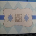
Happy National Scrapbook Day!
FREE Gifts + Extra 12% OFF Orders With Code: CELEBRATE
FREE Gifts + Extra 12% OFF Orders With Code: CELEBRATE

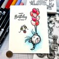
 Give a Cheer
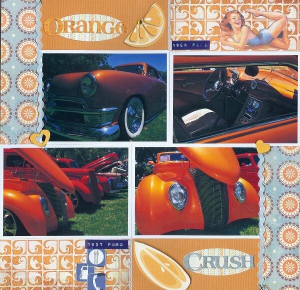
This is for the SHCG BWC #14-Complementary Colors. The pictures of the '50 (top) and '37 (bottom) Fords are from an annual local classic car show that we enjoyed last summer. The copper pearl (top) car was one of my faves at the show which is how I got the idea for the title. There is no additional journaling because this will be a page in a series for an album I plan to make for this event.
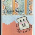
Thanks to Marlene's (scrappygal8), Go Monochromatic BWC last year, I decided the whole album might be monochromatic and I started with a lo on a yellow '55 Chevy Nomad followed by a black '69 Chevy Chevelle. (Please refer to my gallery.) Since I initially wanted to go all monochromatic, but still meet this challenge, and get closer to finishing this album, I made the page mostly orange. I've also decided to use recurring motifs and styles including pinup art, two pps and a solid cs, ricrac, staples, road signs, rubons--whenever possible.
I cut the top orange chippie into a half slice. I layered the road signs to cover up that they're uneven scrap pieces cut from an old stash pp. The pinup girl is by Billy De Vorss.
The scan cut off a sliver of all sides of the page.
Thanks for spreading positivity!


May 08, 2010
March 15, 2010
February 20, 2010
January 10, 2010
November 02, 2009
September 26, 2009
August 16, 2009
August 13, 2009
August 12, 2009
August 11, 2009
August 10, 2009
August 10, 2009
August 09, 2009
August 08, 2009
August 08, 2009
August 08, 2009
August 07, 2009
August 06, 2009
August 06, 2009
August 06, 2009