FREE Standard Shipping on Orders $69+ with code:
FREESHIPPING

Cheers
Give a Cheer

 Give a Cheer
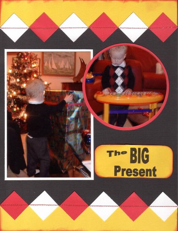
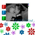
Don't know why or where but feel there is something missing here.. comments?
1X1 squares (turned sideways to match his shirt)
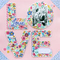
Computer title
Sewing
38/2006
No products have been added to this project.


Thanks for spreading positivity!


January 28, 2006
January 28, 2006
January 28, 2006
January 24, 2006
January 23, 2006
January 22, 2006
January 22, 2006
January 22, 2006
January 22, 2006
January 22, 2006
January 22, 2006
January 22, 2006
January 22, 2006
January 22, 2006
January 22, 2006
January 22, 2006
January 22, 2006
January 22, 2006
January 22, 2006
January 22, 2006