SHCG: Just beautiful. I really like what you did with tearing the papers and the sewing. Great job on the mono color pattern papers coming together in the flowers. and the butterflys are sweet!
SHCG: Wow great job on this, all the paper tearing is awesome and the stiching is great, love how you wrote the journaling in the tag, very soft and pretty :)
SHCG: Ok the colors rock ( I am a pink lover!) I really like the dragonflies they add a great detail!! The torn paper makes it look very vintage to me!
SHCG: Love the photo and the colors here! It's great that you made a page about your friends! I think that the photo is a little too small. Also you can move the tag a little bit closer to the photo. I think that the butterflies should be placed so that they create a triangle between the title, photo and journaling. I like the tearing and the pp!
shcg: Love the colors on this layout. The tearing is a wonderful textural element to this along with the stitching. I love how you frames the photo, however I wish that it was larger and more predominant in the lo. Love the flowers and the dragonflies. I could see some inking on this to mute some of the white tearing, and I, too, agree that the tag is a bit oddly placed. Wonderful page!
SHCG - This is lovely! Amazing combo of the b&w pic, soft colors, paper tearing & beautiful accents. The different subdued patterns/elements work beautifully & harmoniously together. The stitching looks cool, kind of like grass along the bottom edge along the flowers. While I appreciate the interesting way you wrote journaling telling how you know them, & did so in a visually appealing spiral, I must say the small-letter spiral is a little hard to read. I also agree that the tag & believe strip could be moved lower as Brenda suggested, but admittedly I didn't think that until I read her comment. Overall, a truly beautiful page - excellent work, Brian!
SHCG: I like the colors and the flowers a lot! I wish you would remove the tag though... or maybe just move it elsewhere on the page. For some reason, it seems randomly placed on the page.
SHCG: I like all the different textures with the tearing, fiber, vellum, stitching, and embossing. I also like the handwriting underneath the photo. Since the pic is so small in contrast to the size of the page, I'd consider moving the tag, vellum tag, and believe in love strip closer to the photo to keep the focus there. I like the butterflies, but they draw my attention up and away so they might also have to be moved. I like that you included journaling and the contrast between the b/w of the photo and the complementary colors of the rest of the page.
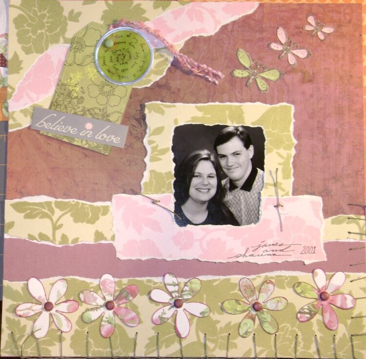
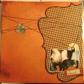
Two of my friends who I haven't seen in a very long time. Journaling: "Two of my favorite people, I lived with James and Shauna from July 2000 until July 2001 (along with Justin, Bryce, Albie, and Zoe)"
Does this project or one of it's images contain pornography, profanity, or other illegal or offensive material? If so, please report it and our moderators will come by and clean it up in a flash.
August 22, 2009
August 19, 2009
August 13, 2009
August 12, 2009
August 10, 2009
August 10, 2009
August 10, 2009
August 10, 2009
August 09, 2009
August 09, 2009
August 09, 2009
August 09, 2009
August 09, 2009