

Scrapbook.com Exclusives 20% to 60% OFF
Plus, Take 10% OFF Orders $100 or More! Use Code: CRAFTY
Plus, Take 10% OFF Orders $100 or More! Use Code: CRAFTY

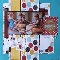
 Give a Cheer
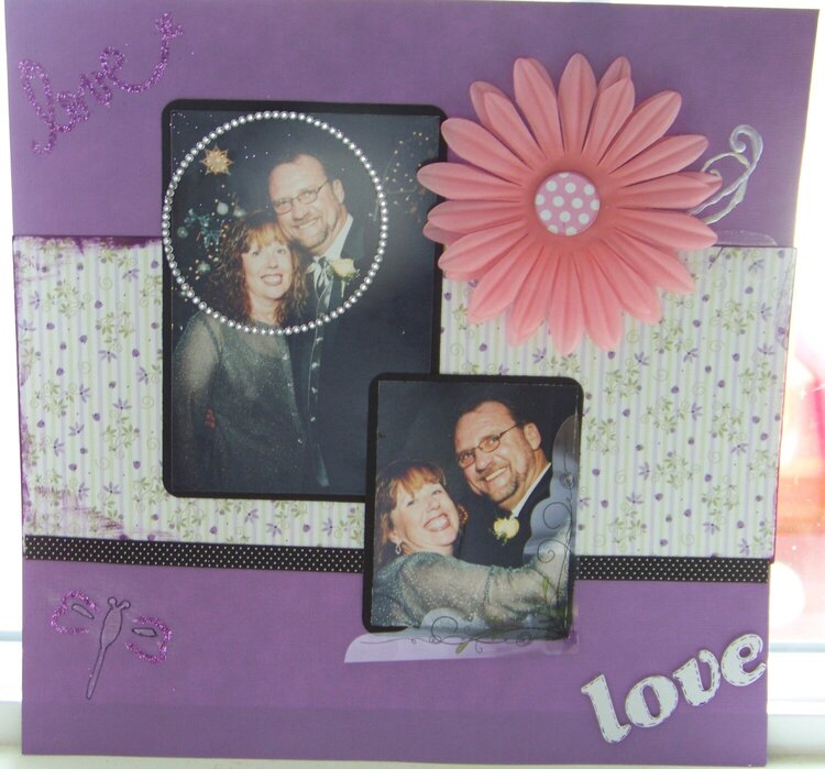
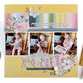
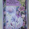
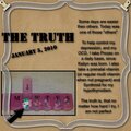
Purple cardstock is Core'dinations. My first time dry embossing :-)
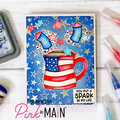
Thanks for spreading positivity!


August 27, 2009
August 21, 2009
August 19, 2009
August 13, 2009
August 13, 2009
August 11, 2009
August 11, 2009
August 11, 2009
August 10, 2009
August 10, 2009
August 10, 2009