SHCG: I think this is a great design, I agree with Brenda about using a white pen to make it easier to read and I would have continued the rick rak all across the page or at least up until the plaid pp. Great job :)
SHCG - Terrific placement overall on this & I love that you captured this as a scrap subject. The plaid pp, rounded corners, & earth tones work well, & I like how the blue picks up the blues from the pics. As Brenda said, the journaling is hard to read (though I enjoyed zooming in so I could get the scoop!). I could visualize perhaps brown writing on a pale blue, so that it could be more easily seen & plus that would repeat the blue again elsewhere on the page, unifying things even more than they already are. I really like how I got the nervousness & transitionary feel through your journaling & pics - marvelous how scrapbooking tells those stories of our lives. Great work, TFS!
SHCG: I like the plaid, rounded corners, and title piece as your choices for this subject. Unless the journaling is more visible irl, I'd suggest using white gel pen, instead. Also, I'd like to see that block with the ricrac moved up to bring all your pieces closer together. The blues really pop on this page.
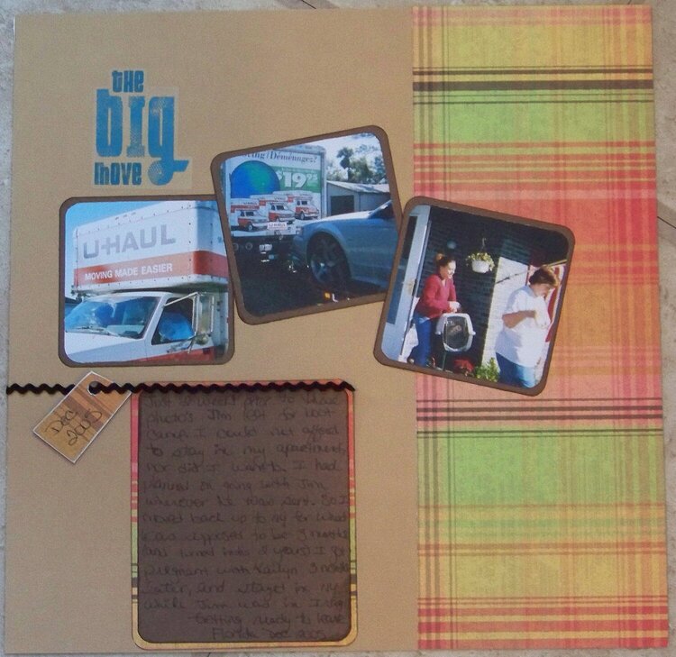
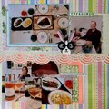
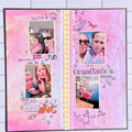
When I left Florida to go back to New York for a few months when DH (then boyfriend) was in bootcamp. I had only known DH a few weeks at this point, so I was a bit nervous about moving around the world with him and the military
Does this project or one of it's images contain pornography, profanity, or other illegal or offensive material? If so, please report it and our moderators will come by and clean it up in a flash.
September 08, 2009
August 24, 2009
August 23, 2009
August 22, 2009
August 19, 2009
August 19, 2009