LOL LIz!!!! This layout is soooo perfect! Not a thing is needed to make it any better. You need to always be confident in your abilities, as everything you create is so beautiful and perfect! This layout is a materpiece.... just the way it is!
I {{{{{ADORE}}}}}} your style LIZ!
Oooo! I just love your digi layouts!!! I really like this...LOVE that frame! Love your choice of pps and how you changed the text color to orange on "within us". Great design (as always)!
LIZ...your talent blows me away! I love when you post stuff b/c I get to drool over it all! this is perfection and I am totally loving that quote! SO cool!
This is so gorgeous! Love the color strip with the bw pic and white background. Love the quote with just a touch of color; I wouldn't change a thing; it's so beautiful :)
I think this is just gorgeous too. You could try putting a pink or gray screen on the lower half of the lo. The writing and other elements would show through but it would mix up the white. Just a suggestion.
It's PERFECT liz!!! The "splash" of color with the b&w is great! Sometimes less is more, right? But I know what you mean about trying to fill the empty space!
I also like it a lot as is, but I like the suggestion of tinting the background slightly. I'd try it with the palest orange possible- it should almost register white to the eye, but have a hint of the orange (akin to one or two drops of orange in a can of white paint).
Cindy
This is gorgeous, Liz! I'm with the no changes crowd. :) I love the orange in the quote & the title - perfect, balanced, happy, and lots of other good words I could think of if I was more articulate in the morning. TFS!
I defiantely don't think it needs a thing! It's absolutely perfectly stunning! :) The heart in the corner really balances the quote well. And LOVE that frame and PP!
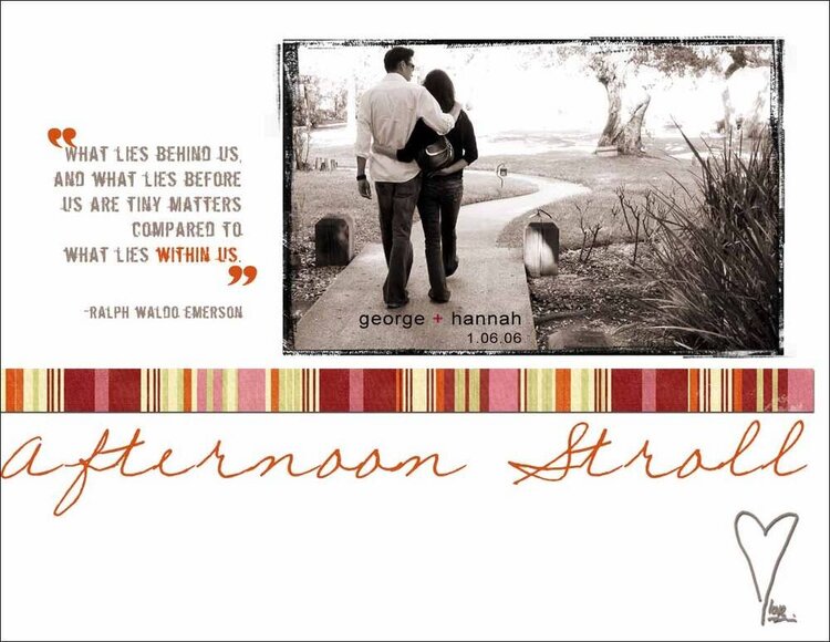
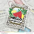
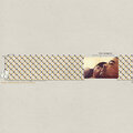
A quickie digi lo. =) Something looks a little off....should I add something? input would be highly appreciated! lol, see that's my problem. I always try to create a clean and graphic lo, and then I'm left wondering how I can fill in the empty space. I'm a spaz!
products used: patterned paper by Amy Tanabe, fonts: dirty ego, FG Elegant Script, century gothic, 2peas journaling dingbat, nancie janitz schmootzy frame, love stamp (my own). Thanks for looking!
Does this project or one of it's images contain pornography, profanity, or other illegal or offensive material? If so, please report it and our moderators will come by and clean it up in a flash.
April 08, 2008
November 03, 2007
November 03, 2007
February 23, 2007
February 03, 2007
March 04, 2006
March 04, 2006
February 13, 2006
February 12, 2006
February 05, 2006
February 03, 2006
February 02, 2006
January 31, 2006
January 30, 2006
January 29, 2006
January 28, 2006
January 28, 2006
January 27, 2006
January 27, 2006
January 27, 2006
January 26, 2006
January 26, 2006
January 26, 2006
January 26, 2006
January 25, 2006
January 25, 2006
January 24, 2006
January 24, 2006
January 24, 2006
January 24, 2006
January 24, 2006
January 24, 2006
January 24, 2006
January 24, 2006
January 24, 2006
January 24, 2006
January 24, 2006
January 24, 2006
January 24, 2006
January 24, 2006
January 24, 2006
January 24, 2006
January 24, 2006
January 24, 2006
January 24, 2006
January 24, 2006
January 24, 2006
January 24, 2006
January 24, 2006
January 24, 2006
January 24, 2006
January 24, 2006
January 24, 2006
January 24, 2006
January 24, 2006