Scrapbook.com Exclusives 20% to 60% OFF
Plus, Take 10% OFF Orders $100 or More! Use Code: CRAFTY
Plus, Take 10% OFF Orders $100 or More! Use Code: CRAFTY

 Give a Cheer
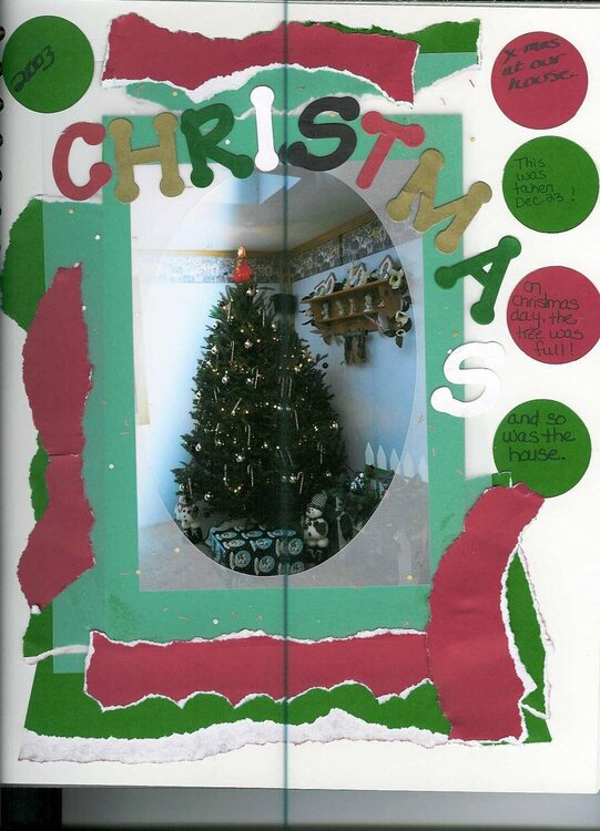
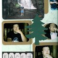
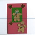
my first time doing paper tearing and my first christmas LO
No products have been added to this project.

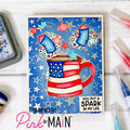
Thanks for spreading positivity!


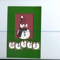


December 28, 2003
December 28, 2003
December 28, 2003
December 28, 2003
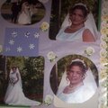
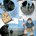
December 27, 2003