SHCG: Cool transition from night to day. I would make the same suggestion I made on the left hand side, a few swirls and a little distressing could turn these great pages into FANTASTIC pages. or turn your next project...
SHCG: Just commenting again on th green paper. I love that you put your ticket on the page. I like to do that as well - I always think one day I am going to look back and be glad I saved it.
SHCG: Great photos! Your stickers are cute. :) I just feel like everything is floating around without anything tying them together... I definitely think Brenda is on to something with the suggestion of a pp strip across both pages.
SHCG: I like that you included the ticket with the sentiment above it. Like I suggested on the other page, I'd like to see the ferry sticker anchored. I also see the title placed differently with Day pushed up and Ferry where the handwritten date is placed on the other page followed by Ride placed next to it on this page. The bottom pic would then have to be scooted over to the right. I think a blue pp strip across the middle of the two pages would tie everything nicely together. Love the window look to the top photo.
SHCG - (Copying my comments from the other side) There are several elements on this 2-pager I really like, Michelle! I think the skyline panorama you created is terrific. I really like the title pp, its pattern comes across like stars & light, evoking both "night" & "day" to me. Cute fish, tower & boat embellies. Fab combo of the yellow mattes & the blue/green background. And I always love the use of actual memorabilia like tickets. I do wish there was a bit more flow between these 2 pages, as my focus is spread out in multiple directions. I think you could exclude at least 2 of the pics due to redundancy (the tower is featured in the middle left page pic & the middle right page pic, the bottom left page pic seems to be buildings you see in other pics, & the other ferry is featured in the middle right page pic & the bottom right page pic, so it's your choice of which 2 to exclude). Keeping the cool panorama, but having 2 less of the other pics on the LO, you might have enough room to place the remaining pics in a sort of "wave" across the 2 pages. Just a suggestion. If you'd rather not exclude pics (I know the feeling), then I'd go w/ Denitza's idea of moving the pics closer together. What a scenic & enjoyable trip you must've had!
SHCG: Great photos! Love the yellow mats on the photos and the ticket! I think you should put the pics closer together and may be outline the title letters so they stand out a little bit more.
shcg: I echo my sentiments from the other side of this LO in regards to the lettering. I think that matting your ticket would maintain consistency among the elements on the page. Love your porthole photo!
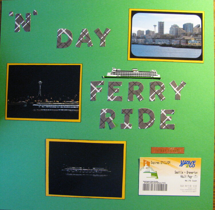
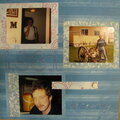
The second part of the LO of my ferry trip roundtrip Seattle to Bremerton. The top right photo (it really isn't crooked, just they way I took the picture makes it look crooked) was taken from inside the ferry using the window as a frame. The two other photos were on the return trip...the Space Needle in the background and then another ferry. The choice of green paper.....I do live in the Emerald City. :)
Does this project or one of it's images contain pornography, profanity, or other illegal or offensive material? If so, please report it and our moderators will come by and clean it up in a flash.
November 14, 2009
November 11, 2009
November 03, 2009
November 01, 2009
October 30, 2009
October 28, 2009
October 27, 2009
October 26, 2009
October 25, 2009