

Thank YOU! It's Customer Appreciation Week!
EXTRA 11% OFF Orders $100+ With Code: THANKYOU
EXTRA 11% OFF Orders $100+ With Code: THANKYOU

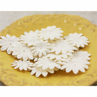
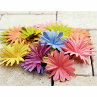
 Give a Cheer
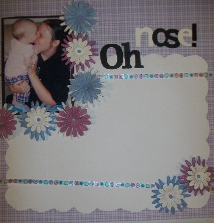
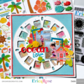
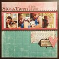
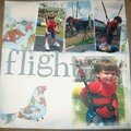
this is my first one page LO, and i need some feedback. the white space will all be journaling...but besides that...what am i missing?! are the flowers too overpowering surrounding the pic? i'll fix the ribbon to make it straight...if it's an alright color? are the letters alright? lemme know!

Thanks for spreading positivity!


November 05, 2009
November 01, 2009
October 28, 2009
October 27, 2009
October 27, 2009
October 27, 2009
October 27, 2009