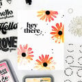
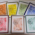
Stamps, Inks, & Stamping Accessories on SALE!
Take 9% OFF orders $100 or more with code: SPRING
Take 9% OFF orders $100 or more with code: SPRING

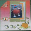
 Give a Cheer
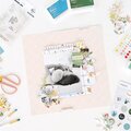
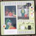
(Updated per suggestions; inked the pp with a bit of brown ink to give age and take away some of the bright white.)
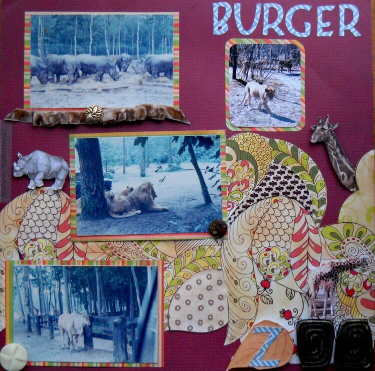
Pictures from the Burger Zoo in Arnhem, Netherlands. I tried to give this layout a retro feel to match the age of the photos. I used ribbon, buttons, and matts as accents. Within the swirls, I cut a second set of some of the swirls, added modge podge and adhered them on top of the original swirl. The Z in Zoo has been popped to match the thickness of the OO buttons. The Rhino and Giraffe are also popped and modge podged.
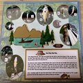
No products have been added to this project.
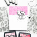
Thanks for spreading positivity!


February 19, 2010
February 18, 2010
February 15, 2010
February 15, 2010
February 12, 2010
February 12, 2010
February 12, 2010
February 12, 2010
February 12, 2010