FREE Standard Shipping on Orders $69+ with code:
FREESHIPPING

Cheers
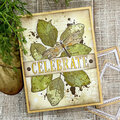
Give a Cheer

 Give a Cheer
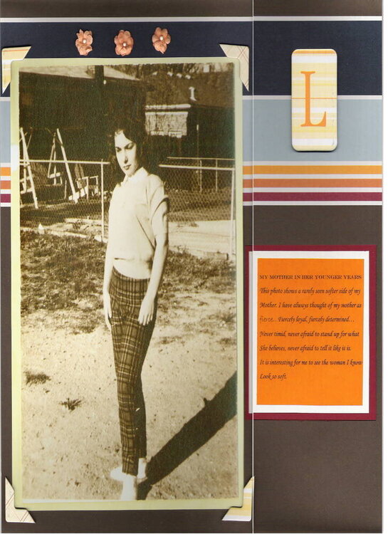
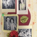
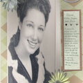
This is a heritage layout of my mom in her youth. I typed the journaling on orange vellum and double matted the journaling. I used making memories pp with chatterbox chipboard letter & photo corners & fabric flowers. Journaling reads: My mother in her younger years. This photo shows a rarely seen softer side of my Mother. I have always thought of my mother as fierce... fiercely loyal, fiercely determined... never timid, never afraid to stand up for what she believes, never afraid to tell it like it is. It is interesting for me to see the woman I know look so soft.
No products have been added to this project.


Thanks for spreading positivity!


March 02, 2006
February 28, 2006
February 25, 2006
February 24, 2006
February 24, 2006
February 24, 2006
February 23, 2006
February 23, 2006
February 23, 2006
February 23, 2006
February 22, 2006
February 22, 2006
February 22, 2006
February 22, 2006
February 22, 2006
February 22, 2006
February 22, 2006
February 22, 2006
February 22, 2006
February 22, 2006
February 22, 2006
February 22, 2006