FREE Standard Shipping on Orders $69+ with code:
FREESHIPPING

Cheers
Give a Cheer

 Give a Cheer
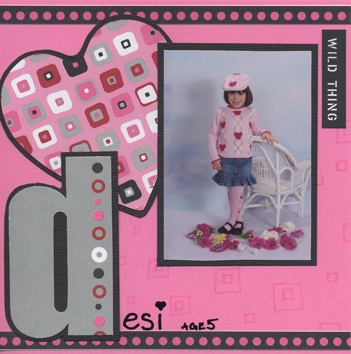
Desi in her fantabulous heart argyle sweater, tights and hat. Age 5. 6x6
No products have been added to this project.


Thanks for spreading positivity!


September 25, 2006
September 25, 2006
September 06, 2006
September 06, 2006
April 05, 2006
April 02, 2006
February 28, 2006
February 22, 2006