
Happy National Scrapbook Day!
FREE Gift + Extra 12% OFF Orders With Code: CELEBRATE
FREE Gift + Extra 12% OFF Orders With Code: CELEBRATE

 Give a Cheer
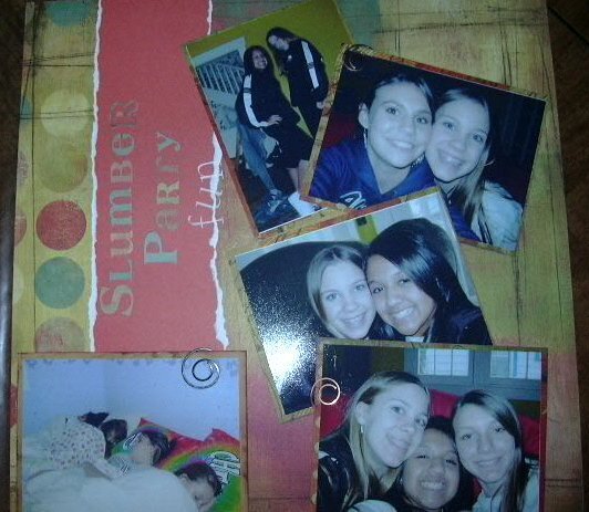
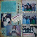
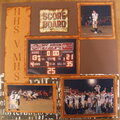
This is a lo of my dd's best friends.
Products used: Basic Grey, circular clips
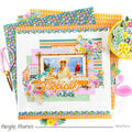
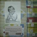
No products have been added to this project.
Thanks for spreading positivity!


August 01, 2006
June 10, 2006
February 28, 2006
February 28, 2006
February 26, 2006
February 25, 2006
February 25, 2006
February 25, 2006
February 25, 2006
February 25, 2006