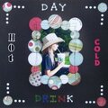
Thank YOU! It's Customer Appreciation Week!
EXTRA 11% OFF Orders $100+ With Code: THANKYOU
EXTRA 11% OFF Orders $100+ With Code: THANKYOU

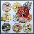
 Give a Cheer
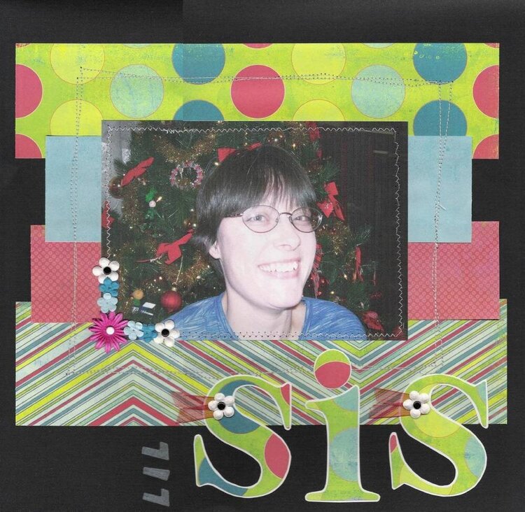
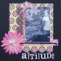
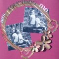
I did this LO for my sister album I'm making her!! This is a pic of me at Christmas time in front of our tree!!
I printed the pic on white cardstock (cs) to soften the pic a bit!
I need to know if I need to add more primas to the upper righthand corner or just leave as is! The stitching is not perfect here in that corner! If primas will be to much what should I add instead!! Any ideas??
Thanks for looking and have a nice day!!
~*Dawn*~
Products used;
cs
MME pp's
Spare Parts Mini Brads
Offray Sheer Ribbon
Primas
stencil (Lil in my title)
white thread
No products have been added to this project.

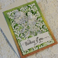
Thanks for spreading positivity!


September 25, 2006
April 06, 2006
March 17, 2006
March 10, 2006
March 09, 2006
March 08, 2006
March 07, 2006
March 06, 2006
March 05, 2006
March 05, 2006
March 04, 2006
March 04, 2006
March 03, 2006
March 02, 2006
March 02, 2006
March 02, 2006
March 02, 2006
March 02, 2006
March 01, 2006
March 01, 2006
March 01, 2006
March 01, 2006
March 01, 2006
March 01, 2006
March 01, 2006
March 01, 2006
March 01, 2006
March 01, 2006
March 01, 2006
March 01, 2006
March 01, 2006
March 01, 2006