This is GREAT!!!! I love your handwriting girl, mine stinks..LOL I would not change anything but I do like the suggestion of adding a small doodle in the left corner bottom ;) You are on a roll girlie!! Keep up the awesome work!
I think you did a great job with handwriting the title-it makes it so much more personal. I like the suggestion of smaller doodles in corner. Great Lo Jasmine.
This is AWESOME!!! Love the colors, the pp mattinggs, the ribbon,s the primas(I wouldn't add the doodles because up already have the black in the title to balance the black doodles), the gorgeous handwritten title; love everything about it and I wouldn't shnage a thing :)
Jasmine, I love that photo of your son watching the birds!! The overall design is fantastic (as always!). You've got such a way with those Primas!! YOU need to be on their design team!! :) May I suggest matting the title (your handwriting is lovely, BTW) with solid or solid-ish paper, then matting it underneath with same BG circle pattern paper as the matted photo on top? I think it would create an overlapping mirror image to balance out the top and bottom. One doodle at the bottom, if necessary, would be a nice finishing touch. It's a gorgeous page as is, Jasmine, and full of very scraplift-tempting ideas!!! Makes we want to head out to Brisbane myself!
I love the hand written title! Looks great! I love the pp, and the ribbons are perfect! I can tell you put alot of time, and love into this. I would not change it at all!
I love it the way it is. I don't think I would add doodles to the left hand side. I can't see how you would place them that wouldn't look crammed in. I think it's great.
I love this LO!!! I love the pp and the primas. Great job handwriting the title. I would have never guessed you wrote it yourself. I love the primas as photo corners ( I am totally going to scraplift the idea) and the doodles!! I think the left corner should get doodles too but maybe smaller to fit. Could also add doodles horizontally beside the title to add emphasis. That's just my opinion, though, as this page looks great as is. I absolutely love it!!!!
WELL I love this as is!! I wouldn't change anything!! I love love love love your handwriting for the title and those pic's are soooo cute!! I love those primas and ribbons they tie everything together very nicely!! Super cool design and paper combo!! Awesome job!!
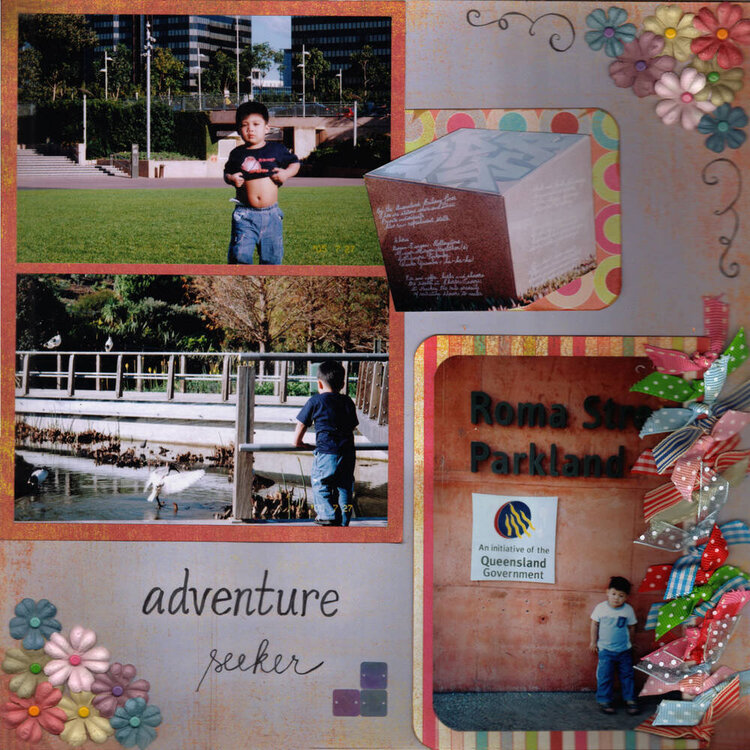
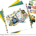
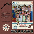
Another Brisbane layout. I've finally been able to add 4 pics in one page, I was planning on 4 but it just doesn't look nice. Title is my own handwriting. I made some doodles on the side of the primas. Should I leave the lower left corner as is? or should I add the doodles too (but they wouldn't fit tho')? I inked the ribbons too. TFL!
Does this project or one of it's images contain pornography, profanity, or other illegal or offensive material? If so, please report it and our moderators will come by and clean it up in a flash.
March 08, 2006
March 05, 2006
March 05, 2006
March 02, 2006
March 02, 2006
March 02, 2006
March 02, 2006
March 02, 2006
March 02, 2006