
Happy National Scrapbook Day!
Extra 10% OFF Select Scrapbooking Brands with Code: NSD24
Extra 10% OFF Select Scrapbooking Brands with Code: NSD24

 Give a Cheer
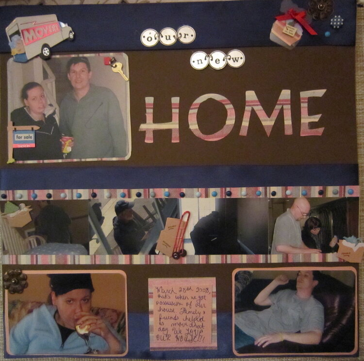
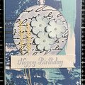
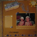
we bought our house in 2008 and the closing date was march 28 2008
No products have been added to this project.


Thanks for spreading positivity!


July 07, 2010
July 02, 2010
June 29, 2010
June 28, 2010
June 24, 2010
June 17, 2010
June 17, 2010
June 13, 2010
June 11, 2010
June 06, 2010
June 06, 2010
June 06, 2010
June 06, 2010
June 06, 2010
June 06, 2010
June 05, 2010
June 05, 2010
June 04, 2010
June 04, 2010
June 03, 2010
June 03, 2010
June 03, 2010
June 03, 2010
June 03, 2010
June 03, 2010
June 03, 2010
June 03, 2010
June 03, 2010
June 03, 2010